Limited colour palettes can help improve your colour theory and use of colour.
Colour affects emotion, tone, and most importantly, composition.
A limited colour palette can help you select the correct colours for your artworks.
Colour has powerful effects on the brain, with different colours communicating different messages. It’s crucial that the colour of your art hits the nail on the head.
The first impression of an artwork is its colour and composition. An artwork with poor colour choices can leave a negative first impression.
Within this blog post you will learn why limited colour palettes can strengthen your colour. I’m sharing my top limited colour tips, an introduction to the colour wheel, and different limited colour combinations that you can use. I’ll also share different colour combinations that you can use within your work. I’ll be discussing gamuts, warm and cool colours, and a conclusion to sum it all up.
On this page
A limited colour palette has transformed my use of colour and colour theory. I am confident you’ll love how limited colour palettes can help your colour selections. If you’re struggling with your colour, then this article can help push your artwork to the next level.
Why Do I Recommend A Limited Colour Palette?
Beginners often use lots of colours to create their art. Certain colours clash with other colours, and there’s not a central colour theme – often resulting in disappointing outcomes.
Instead of using a magnitude of colours, a limited colour palette forces you to think about the colour you’re using without selecting colours randomly.
“Colour is very much like a bank account. If you dip into it too much soon you will have none” – Andrew Loomis.
As you’re selective over your colours, you can think about the tone and emotion you want to evoke in your artwork.
Some more reasons why you should limit your colours
- Aids simplicity and removes confusion when thinking of that colours to use.
- It strengthens your colour as you become a smarter artist.
- It improves composition as you can selectively place colours to point towards your focal points.
Famous Artists Who Used A Limited Colour Palette
These artistic masterpieces palettes below have used limited colour palettes to create their work. Alongside strong compositions, the colours they use extraordinary results.
Girl With A Pearl Earring, 1665, oil on canvas, by Johannes Vermeer, uses blue, cream and a hint of red.
Wheatstacks (End of Summer), 1890–1891, oil on canvas, by Claude Monet, uses red, brown, yellow and green.
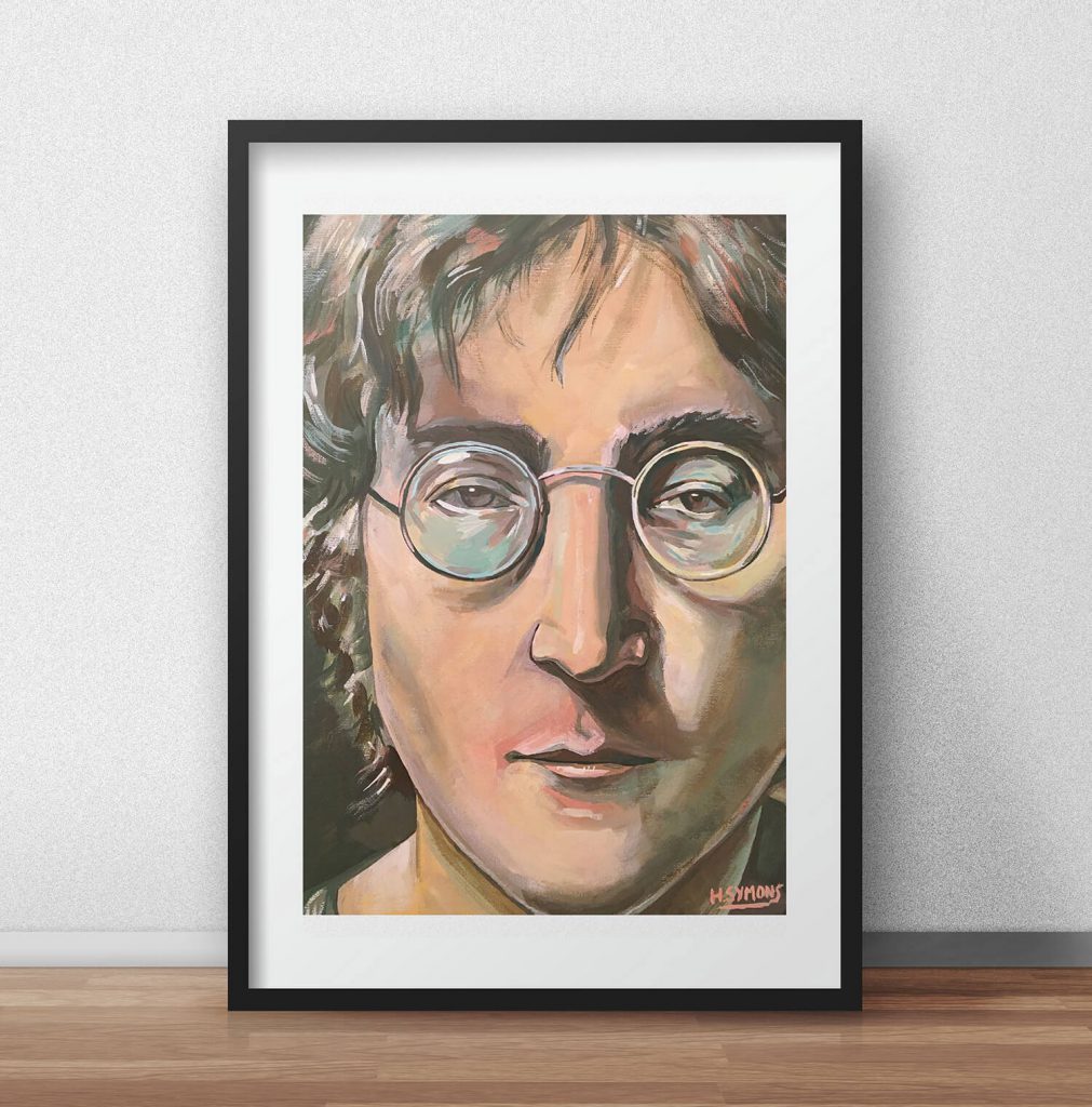
The Old Guitarist, 1903–1904, oil on panel, by Pablo Picasso, uses blue, brown and yellow.
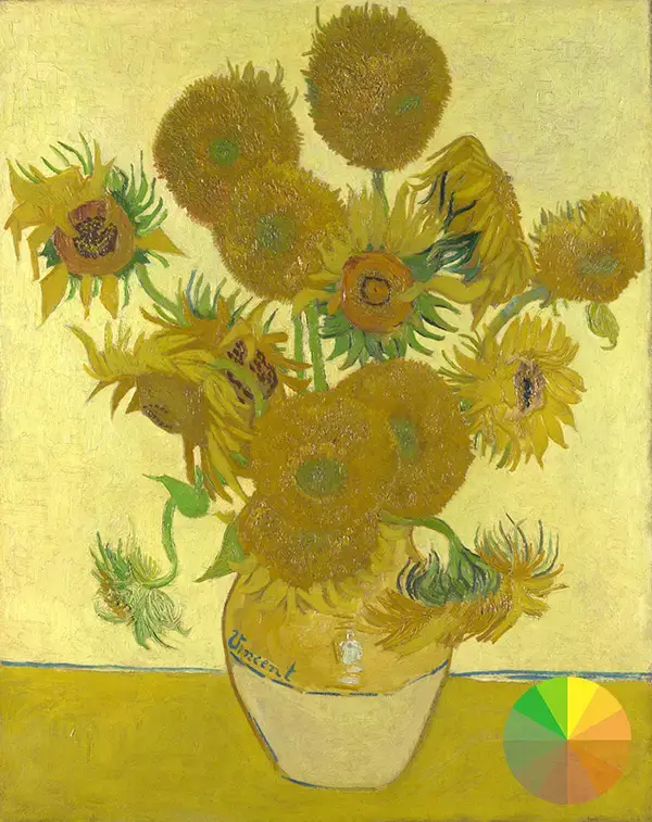
Sunflowers, 1888 – 1889, oil on canvas, by Vincent Van Gogh, uses yellow, green, brown and orange.
The Splash, 1966, acrylic on canvas, by David Hockney uses blue, brown / red, green and yellow. All of these examples use a limited colour palette and a selected colour gamut.


These famous artists didn’t chose their colours at random. These artists, and many other famous artists, use colour to evoke emotion in the viewer, and to aid the composition.
If these artistic geniuses used limited colour palettes, then us artistic mortals should also do the same. In order to use a limited colour palette within your art, you must first understand the colours that make up the colour wheel.
The Colour Wheel
Understanding the colour wheel should be your first point of call to improve your colour. I’ve shared the complete guide to the colour wheel, so I won’t go into too much detail, but it’s worth mentioning again.
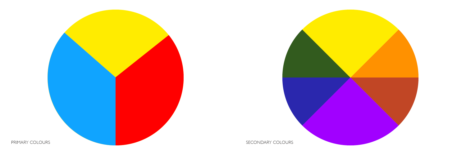
Primary and secondary colours make up the colour wheel. Primary colours consist of red, yellow and blue (you remember the song growing up).
Mixing primary colours forms secondary colours: purple, green, and orange for example. A tertiary colour mixes one primary and one secondary colour. Like blue-purple for example.
From here, you can select select colour areas from the colour wheel, called gamuts. This is essentially how you can choose a limited colour palette.
Limited colour palettes and your selected gamut can be complementary colours like blue and red (colours that sit on opposite ends of the colour wheel), analogous colours (colours that are adjacent to one another on the colour wheel), or triadic colours (three colours equally spaced around the colour wheel).
I’ve talked about this in detail in a previous article which helps you use how to use colour.
Limited Colour Palettes You Can Use
If you’re new to using limited colour palettes, I would recommend you use an analogous colour palette first. Not only is this colour scheme quite simple to grasp, it’s also going to be rewarding in the first instant.
Analogous colours are colours that are adjacent to one another on the colour wheel. Often one colour is a dominant colour, while the other colours within the gamut act as an adjacent to enrich a piece.
Going back to the colour wheel, selecting an analogous colour palette is simple. You can see a few analogous colour gamuts that I’ve selected below.
Using a limited colour palette forces you to stay within your gamut, making it easier to work with. (Do note that my analogous colour palettes below do not indicate hue, chroma or value – which are important to consider when creating your colours). If you want to learn more about these elements, check out James Gurney’s resource.

You can choose warm colours with cold colours, a complementary colour palette or a triadic colour palette. The whole idea with these colour combinations is limiting your colour, so you don’t use every colour within the colour wheel.


Some colour combinations are more difficult than others; analogous is easier than a complementary colour scheme, and each offers different results.
If these colour combinations result in frustrating results, use a maximum of 2-3 colours, and try and avoid saturated (bright or intense) colours. Leave the saturated colours for areas of interest, and use sparingly.
Limited Colour Palette Essential Tips
Even though a limited colour palette often results in satisfying colour outcomes, unfortunately, it’s not always the case.
However, there are things you can do to minimise this by being smart about your colour choices.
- Use grey / unsaturated colours freely, but limit your use of saturated colours: a picture more often fails when artists use intense or saturated colours rather than grey or unsaturated colours. People often regard grey as dull, however, it’s a great friend to the artist. Instead of mixing grey from pure black and white, use the colours within your limited colour palette to create grey. For example, if you’re using a limited colour palette of red and green, mix these two colours together with white and a touch of brown. You can place your dominant or accent colours next to the grey section and they will harmonise.
- Colour and composition come hand in hand: you can use excellent colour combinations but if your composition is lacking, then your artwork will likely be disappointing. Composition is crucial to lead the eye and keep viewers engaged. Draw thumbnails in your sketchbook and work on the composition on any final artwork that you create. Things like the rule of thirds and the golden ratio can help you master composition.
- Think about how you want your colour to communicate: If you want to create a dramatic illustration, then you might choose strong contrasting colours. Blue and green might be perfect for a cold and wintery scene, however, a dangerous scene might include red, orange and a burst of blue. Different colours have different meanings – use them to your advantage!
- Colours never sit alone: when selecting your colours, remember that a colour always sits against another. For example, a dark blue looks different against a dark yellow compared to a light yellow. The perception of the same colour changes when placed against different colours. Keep this in mind.
- Plan beforehand: It’s really important to plan your colours before you put any colour to paper. When you know the type of composition you want to create, think about your colour. Use the tips above in your sketchbook, as this saves time and mistakes, and you avoid arriving at your blank artboard not knowing or guessing which colours to use.
Limited Colour Palette Conclusion
I love using limited colour palettes within my illustration work. I love its simplicity, and artists have formed some of the best creations from limited color palettes.
It’s a never-ending discovery for me, and I know there’s still a whole lot to learn, which I’m excited to share with you in the future.
Here’s a round up of what we have covered in today’s blog post
- A limited colour palette aids simplicity and can improve your use of colour.
- Artists like Pablo Picasso, Vincent Van Gogh to Johannes Vermeer have all used a limited colour palette to create artistic masterpieces.
- Learn the colour wheel to help you use limited colours.
- Limited colour palettes include complimentary, analogous to tertiary colours.
- The amount of different limited colour palette combinations is endless! Experiment with your colours to see what you can come up with.
If you liked this article you may also like:
Pen & ink drawing: A simple guide by Alphonso Dunn book review
How to fully improve the accuracy and proportions of your drawings
How To Draw The Head From The Front
Comment how you got on in the comments section
I’ll love to know how you have used limited colour palettes, and if this article has been useful to you. Please comment below with your comments and feedback, I’d love to hear what you think about this article.
If you didn’t already know, I create greeting cards, original canvas paintings and art prints on my online Shop, and also on my Etsy Store. Offering you the perfect gifts for loved ones (or as a treat for yourself).
I’m a UK freelance illustrator, designer and artist, and specialise in editorial and publishing illustration. Check out my illustration portfolio, or have a look around my blog – filled with tips and tricks to help you with creativity, art and illustration – amongst my new illustration work and what I’m up to!
Thanks, guys, and I look forward to the next article!
Many thanks for listening and visiting my news page today. You can follow what I’m up to on my Twitter and Facebook pages, I’ll really appreciate it if you do, and don’t be afraid to say hi to me! Many thanks again, and have a great day!
 9th May 2020