Learning the golden ratio can improve your art.
Artists throughout time have used this approach, creating engaging compositions that turn heads.
However, creating dynamic compositions can be challenging, especially for beginners. Learning the golden ratio is a fine structure, however you need to learn how to use it to be effective.
Where should you place your focal point? What structural lines should you arrange? Feeling stumped on where to begin?
These questions are certainly not uncommon. I have your back though! If you want to improve your compositions, the golden ratio is worthwhile learning, and I’m here to show you how.
Within this article you’ll learn what the golden ratio is, and how you can create a golden rectangle. You will learn the golden circles, and how you can apply this to your artistic compositions. Additionally I’ll be sharing paintings and logo designs using this methodology too.
To further improve your colour and compositions, check out my article on the colour wheel. Not to mention my tips to help you create an amazing illustrator portfolio. But for now, lets discuss what the golden ratio actually is.
What Is The Golden Ratio?
The golden ratio is a ratio, of 1:1.618, or Phi. This ratio refers to the Fibonacci Sequence, a number arrangement. This numbered progression is when the next number is a total of itself and the previous number. This starts at 0, and is ever-lasting.
0, 0, 1, 1, 2, 3, 5, 8, 13, 21, 34 etc.
Its said that this rate of growth is pleasing to humans. It’s sequential and it’s infinite. For example, 0+0=1, 0+1=1, 1+1=2, 1+2=3, 2+3=5 and so on.
This rate of growth roughly boils down to the ratio of 1:1.618, the golden ratio. If you look at the golden rectangle using metric measurements, one side will be 1cm, and the other will be 1.618cm. Here’s an interesting TED talk all about this sequence.
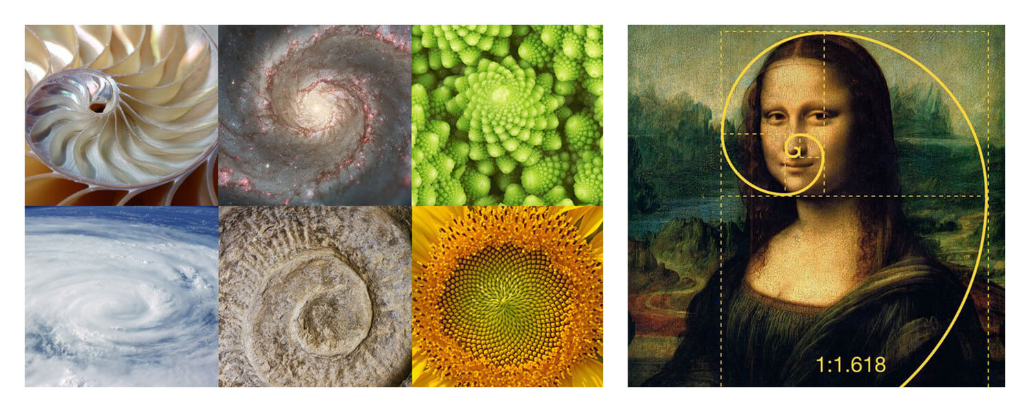
The golden ratio is also known as the golden mean or the golden section. Artists dating back 4,000 years ago, such as Leonardo da Vinci, have used the golden ratio.
The golden ratio features in man-made objects like the Parthenon in Greece to the Taj Mahal in India. Yet it’s also seen throughout nature; in spirals of a flower or the Milky Way.
It’s also used in famous artworks like the Mona Lisa. The golden ratio sits on top of the face, to the arm position. The curve of the arm and the clothing leads the eye to the center of the face. As human beings we’re drawn to faces within art, and the use of the golden ratio adds further focus to her face. Here’s a good resource if you would like to find out more about previous artists using this method.
The Golden Ratio in Art & Design
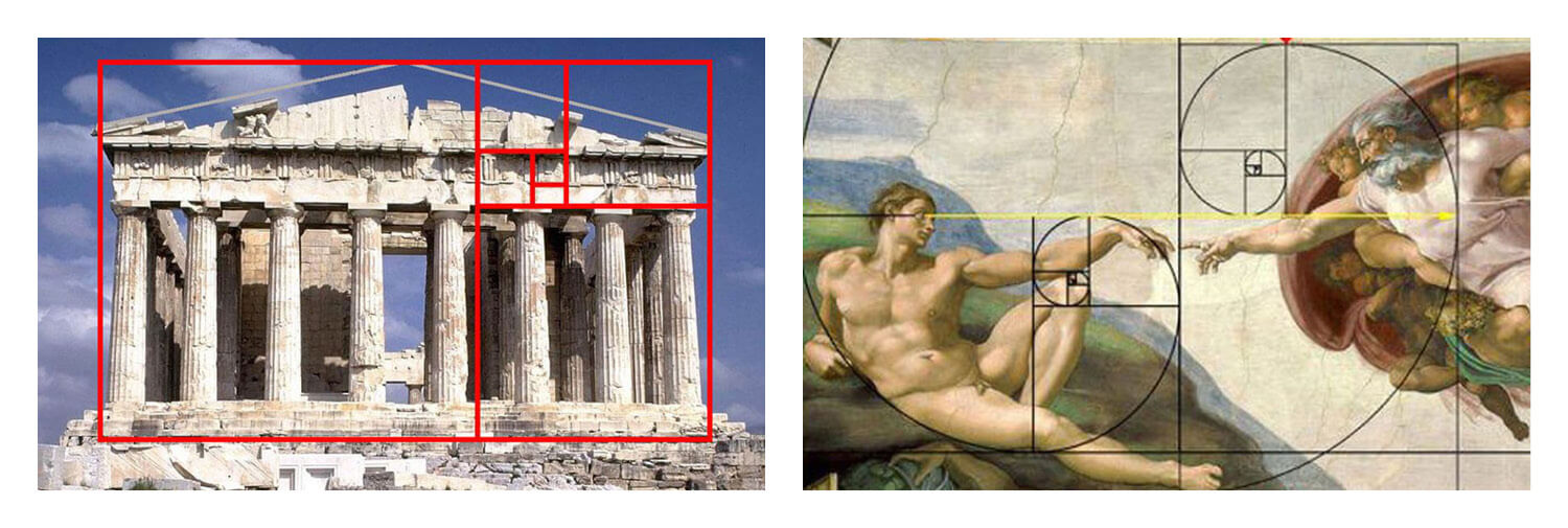
The Parthenon’s architecture sits along the structure of the golden ratio. This is prime example of how artists and craftsmen have used the golden ratio for centuries.
Michelangelo’s ‘Creation of Adam’ uses two golden ratios that work together to form the image. Adam’s body sits along the golden ratio’s curve, with the rest of the piece rests on Adam’s leg and arm. If it’s good enough for fine architecture and Michelangelo, it’s good enough for us! Take advantage of this knowledge and introduce the golden ratio into your work.
Why Is The Golden Ratio Important?
The golden ratio leads the eye, and gives you structure when preparing an image. This is in contrast to arranging your composition at random. This can often lead to disappointing compositions.
If you have an important part of an image you want people to look at, using the golden ratio is a great technique to try. Imagine creating a composition and knowing exactly how your viewers will look at it? How cool is that!
This is exactly the appeal of the golden ratio, and shows you how important it is. If you couple this up with using great colour, then you’re onto a winner!
Not only this, the golden ratio is important because it’s pleasing on the eye.
Why Is The Golden Ratio Aesthetically Pleasing?
According to Adrian Bejan, professor of mechanical engineering at Duke’s Pratt School of Engineering, states the golden ratio is interpreted faster than any other composition.
“Shapes that resemble the golden ratio facilitate the scanning of images and their transmission through vision organs to the brain. Animals are wired to feel better and better when they are helped and so they feel pleasure when they find food or shelter or a mate.”
From animal evolution of antelope to deer, these animals scan the horizon for potential danger. Scanning for danger from side to side is smarter and quicker, in contrast to up and down.
The golden ratio describes the horizon and forms interest from side to side. It links back to the rule of thirds, which this approach is similar. Splitting an image into three equal horizontal boxes, and three equal vertical boxes. With the golden ratio, these boxes or lines split into three dynamic boxes, dividing by 1.618. These are the same thing, focusing on three elements over any other number. I’ve mentioned this in my triadic colour scheme post too. Using three colours within the colour scheme. As humans we love odd numbers, and the number three. It keeps appearing time and time again, and it’s no coincidence.
The Golden Ratio In Web Design
The golden ratio not only appears in art, but also in web design.
For aesthetic pleasing web pages, web designers deliberately structure content inline with the 1:1.618 ratio. Take Twitter’s desktop web layout for example, this is deliberately organised to fit within the golden circle.
The result?
It looks pleasing on the eye and draws the eyes to the most important part of the webpage. It’s no coincidence that the ‘Tweet’ blue button sits on the left arch of the circle, and the top ‘Trending’ hashtag pretty much sits on the inner circle of the structure too.
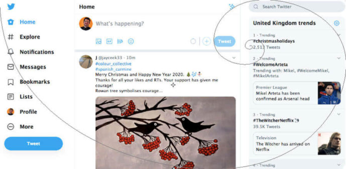
This layout keeps users on the web page and makes them interact; something very important in today’s digital culture.
Have a look at the National Geographic website below. They use the golden ratio to advertise their ‘Latest stories’, and their ‘Best photos of 2019’ is close to the bottom arch of the golden circle.

This layout is engaging and makes you want to find out more. Not only is the National Geographic’s logo using this structure (which I’ll get to in a moment) but their web layout if heavily inspired by the ratio too.
When designing your website, how can you incorporate the golden ratio?
How To Create A Golden Rectangle
1) Start by drawing a square which is equal on all sides – let’s say 100px (or 10cm if drawing manually) for the width and height. (I suggest you use Adobe Illustrator or Photoshop).

2) Create a duplicate of this square and place to the right. Multiply one side of the box by 1.618 to form a rectangle. If you’re using Adobe Illustrator, you can do this by going to ‘Transform’. If you didn’t already know, you can also input calculations within these fields as well. (Make sure that the anchor symbol is turned off, as this will multiply each side if left on).
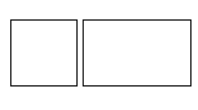
3) Select both boxes, and using the align tool, align them both to the left hand side, making sure the align tool is set to ‘Selection’ not the page. This will make each box overlap one another, which is the intended outcome.
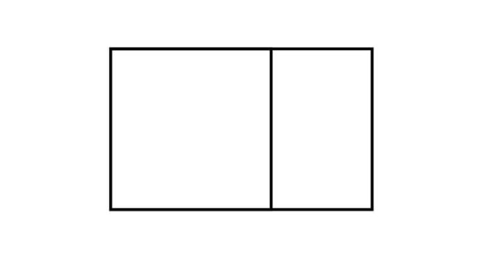
4) And there you go, your golden rectangle is complete! You can now keep creating squares in each of the rectangles, which ultimately goes on indefinitely.

How to use the Golden Ratio Within Your Compositions
Simply using the golden ratio is a great start, and can help improve your compositions. However, there’s a few things you need to keep in mind to maximise this approach. It’s no good having the structure in place without knowing how to use it. Here’s an example below:
- Firstly, I split my image into the golden ratio. Taking the width and height and dividing each by 1.618. Whatever the size of your image, this process works exactly the same.
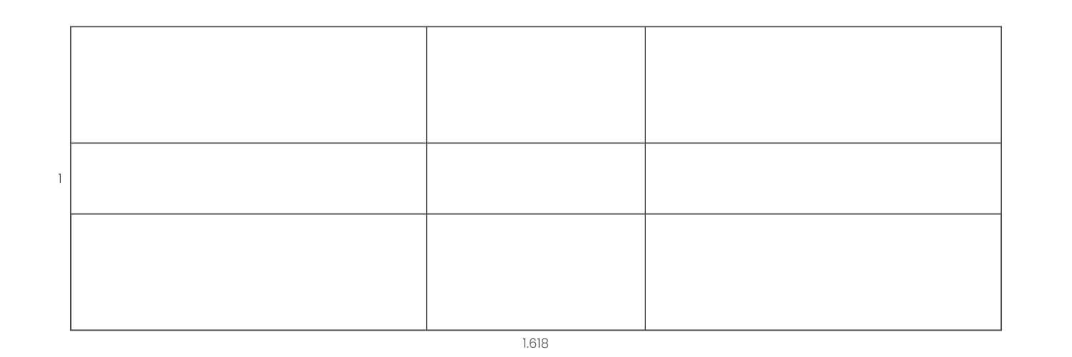
- Secondly, I draw diagonal lines from each point, described with the red lines below. I’ve included simple, average and complicated versions below. Pick the one you feel most comfortable with. If you’re a complete beginner, go for the simple version.
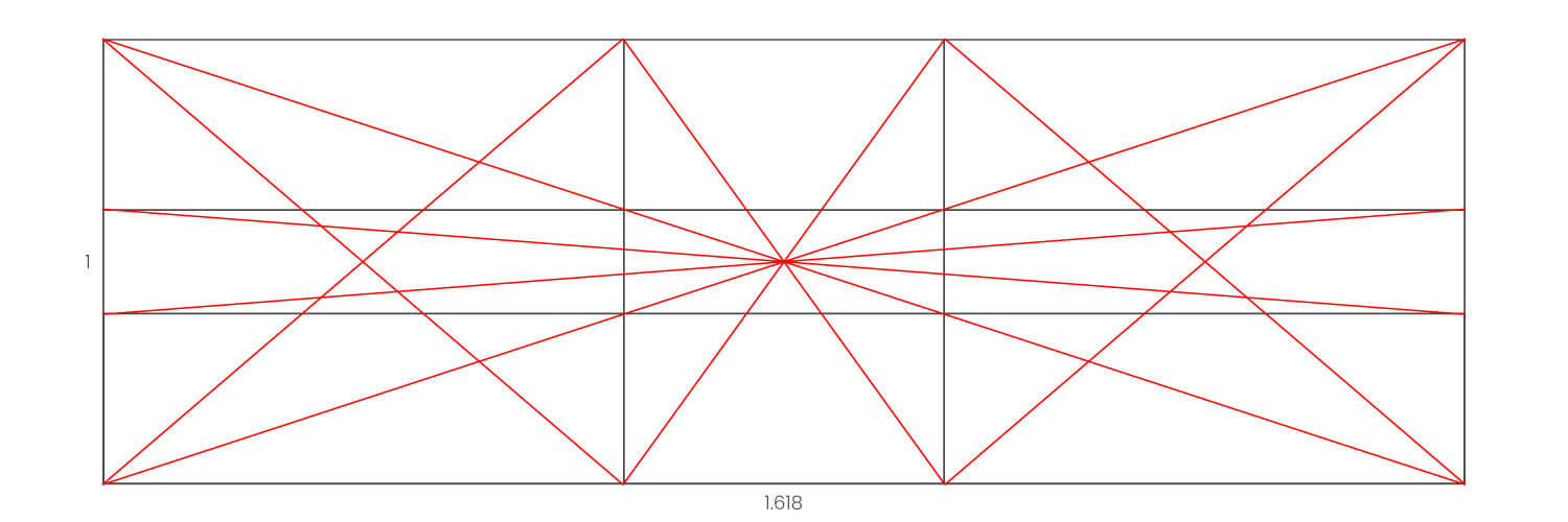
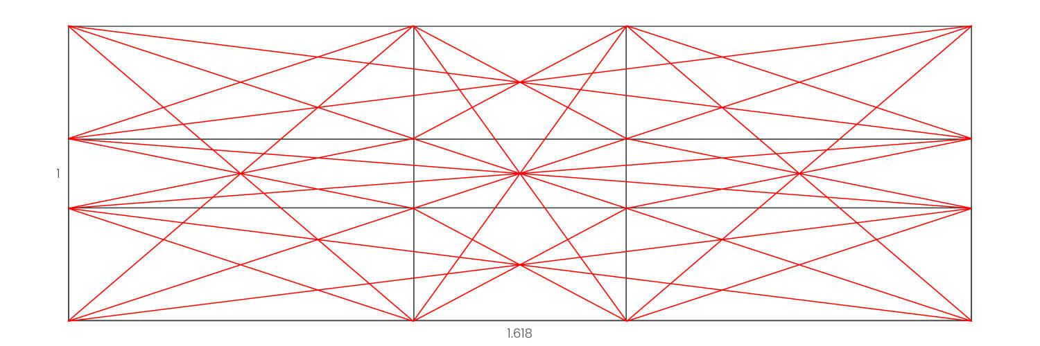
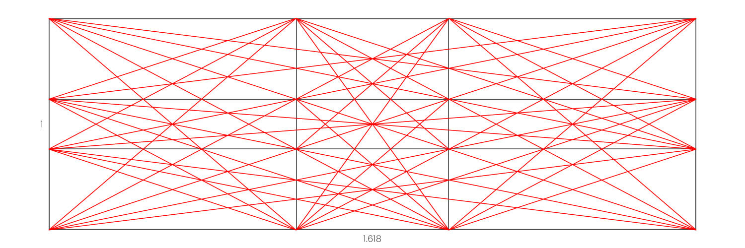
- Now you have this in place, you can start creating your composition. Notice the elements of my artwork positioned on these lines. Not only that, I’ve arranged the elements on where the lines intersect. Detailed in the image with the blue circles.
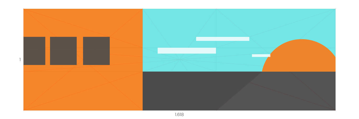
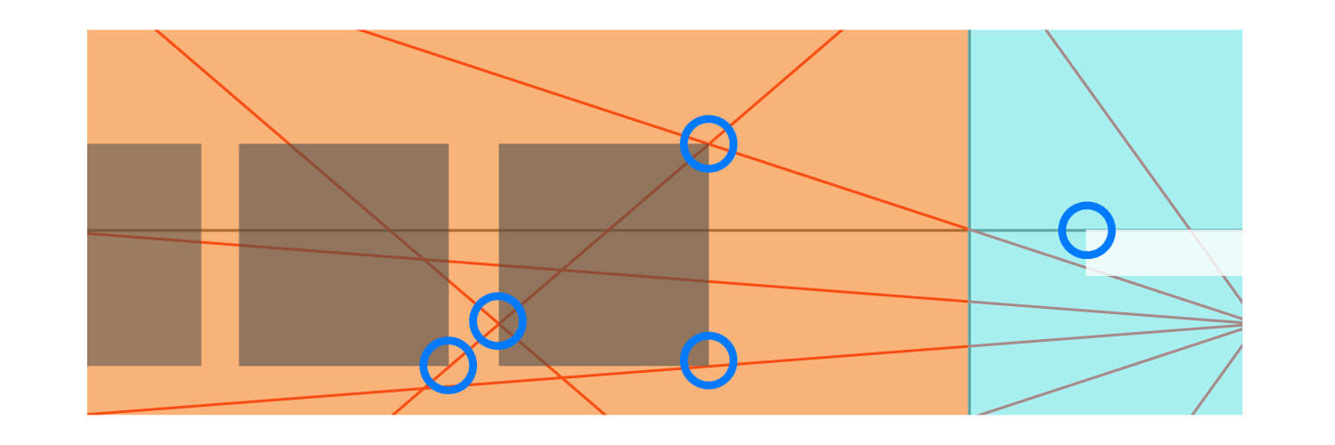
- You can go into depth, and position all elements on the golden ratio.
- Finally, the composition is complete! Even though it’s an example to show you, it’s an engaging landscape composition. See what different artworks and compositions you can create using this formula.
How To Create A Golden Spiral
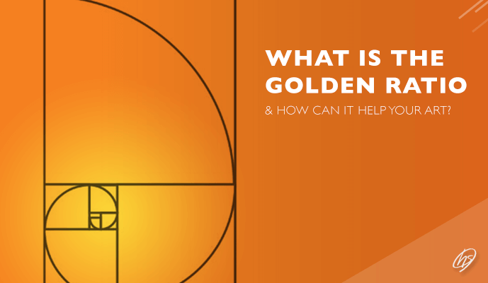
Using your golden rectangle, we’re going to create the golden spiral.
1) Place a circle in the largest square.

2) Multiply this circle by 2 – so your 100px circle will now be 200px circle.
3) Place the circle so that the axis points are central to the lines of the square.

4) Delete the 2 anchor points to create a semi-circle. This semi-circle should be the height and width of the square.
5) To create the second semi-circle, duplicate the previous semi-circle you just made, and divide it by 1.618
5) Rotate 90 degrees, and place within the right smaller square.

6) Keep repeating this until you’ve filled all of your squares (remember you will have to stop at some point as it’s an infinite sequence).
7) Your Golden spiral is complete!

How To Create Golden Circles
1) Using your golden rectangle, place a circle in each square
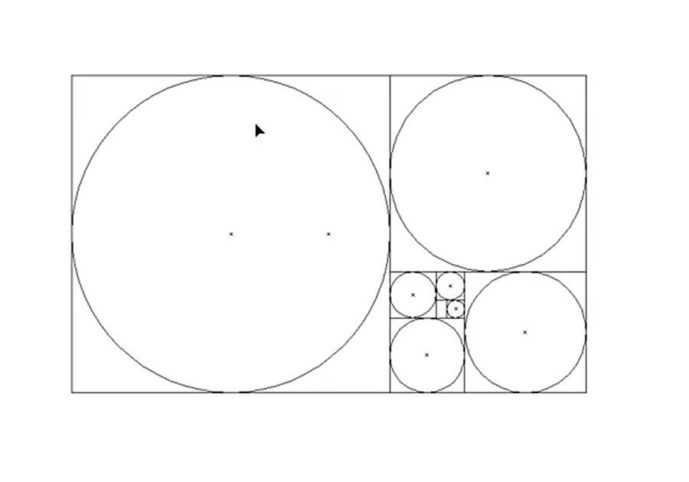
2) Select all of your circles and align centrally

3) And there you go! Golden circles complete!
Golden Circles In Logo Design
The most famous logos throughout history use golden circles.
From Apple to Twitter, these golden circles create pleasing and dynamic logos. For more info on golden circles in logo design, this is a great resource.
You can see the logos below are using these circles within their design. This brings logic, rhythm and a meaning behind every logo.
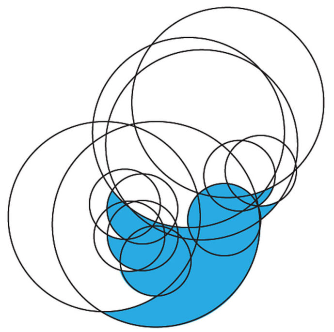


The National Geographic uses a ratio of 1:1.618 for it’s logo of a rectangle. Toyota and BP uses different sizes of golden circles within their logos too.
Logo Using Golden Ratio Circles
As we’ve been talking about the golden ratio, I wanted to take the opportunity by sharing a recent logo design. Using the circles from the golden ratio, I have constructed the red logo below.

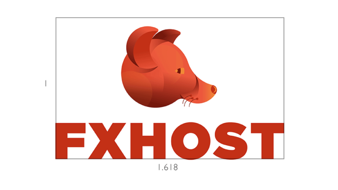

I experimented with circles, forming the fox’s head. Instead of plucking circles at random, the design has meaning and looks better for it! Everything is from the ratio, the fox’s whiskers, the shadows to the highlights.
Alongside this, I have also made the ratio of the lettering & crest of the logo 1:1.618. The golden ratio is definitely singing from this design! I’ve used three whiskers, three shadows, and three parts of the eye, relating to the Fibonacci Sequence. Humans love odd numbers, instead of boring symmetrical even numbers.
The design conveys a cheeky, modern and energetic logo. This helps bringing warm colours into the palette. Find out more about this logo design using the golden ratio on my portfolio.
Summing Up What You’ve Learnt
The golden ratio is a fantastic device to bring structure to your compositions. You now have an understanding of what it is, famous artists to use this method, and how you can create your own.
Lets recap what we’ve learnt:
- The golden ratio originates from the Fibonacci Sequence. This numbered progression is when the next number is a total of itself and the previous number.
- You can create your own golden ratio image by dividing the width and height by 1.618.
- Artists throughout time used this technique.
- Draw diagonal lines from each corner and line.
- Position the elements within your composition on this structure.
- The golden ratio is evident in logo, website and social media design.
- Not only this, but you can create the golden circle and spiral too!
I’ll love to hear how you have tried, experimented and used the golden ratio! Do write me a comment below.
If you have enjoyed this article, check out my post on how to create point perspective. If there’s been one device that has improved my drawing skill, it’s learning perspective!
I also create greetings cards, original canvas paintings and art prints on my Shop, and also on my Etsy Store. Offering you the perfect gifts for loved ones (or as a treat for yourself).
I hope you have enjoyed this blog post guys, and see you on the next article!
Many thanks for listening and visiting my news page today. You can follow what I’m up to on my Twitter, Facebook pages, I’ll really appreciate it if you do, and don’t be afraid to say hi to me! Many thanks again, and have a great day!
 8th November 2019
