Want to discover how to learn composition for your art?
Crave to learn from the artistic masters?
Well thankfully you’ve come to the right place! Composition plays a crucial role within image creation. It can make or break a piece, regardless of whether it has strong colours or showcases epic draftsmanship. Great composition can make others sit up and take notice, great composition can draw people to your work, and great composition makes your art different from the crowd.
Like colour, tone and skill, composition is one of the most important aspects of creating fantastic art. This blog post offers 5 master art examples to help you discover how to learn composition. I’ll help you grasp the different techniques the masters of composition used within their art to create masterpieces. All of the images that I reference use different composition methods (with some methods overlapping between images), but I will mainly focus on one compositional method per artwork.
If you’re new to my blog or illustration website, I share regular tips, tricks and advice to help you with your art. I also publish blog posts showcasing my recent commissioned and personal illustrations too. But mainly this blog is your number one place to learn about everything from colour, composition to illustration tips and tricks.
Why Should You Bother With This How To Learn Composition Guide?
Composition makes or breaks artworks. If you have great artistic composition, it draws people to your work. It keeps them engaged for longer, and it adds to your appeal as an artist.
If you improve your compositions by just 1% (linking back to James Clear’s marginal gains’ philosophy which he calls ‘Continuous Improvement‘), it’ll do wonders for your art and image making.
Plus, when you think about the artistic masters you love (past or present), I’m certain you love this particular artist because of their compositions (even if you didn’t know it!). Great composition draws people to your work – it adds appeal, it adds drama and it adds to your overall skill.
It’s an important element which I’m constantly trying to improve myself. Fortunately I write blog posts like this one on how to learn composition, which teaches you – but also teaches me too.
So don’t disregard how crucial this artistic topic is! So let’s get into the first compositional example.
The Golden Ratio – Bathers at Asnières by Georges Seurat
The first composition is Georges Seurat’s ‘Bathers at Asnières’, 1884, oil on canvas. This is one of my favourite paintings, for the use of colour, expression and composition.
This delicate painting doesn’t look motionless, static or rigid, even though it’s all geared towards the golden ratio.
If you’re unfamiliar with the golden ratio and have no idea what I’m talking about, I’ve discussed it here for you.
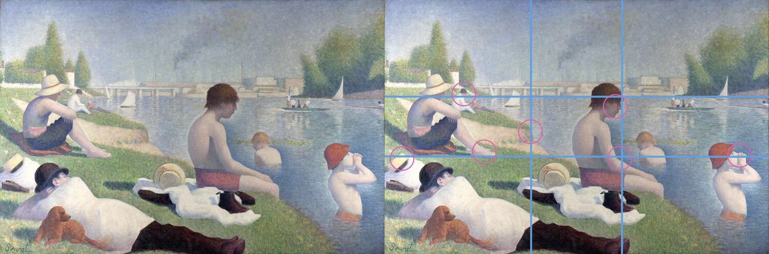
It’s not just down to ‘luck’ that this painting sits on these golden ratio lines – as Seurat painted ‘The Bridge of Courbevoie’, 1886 – 1887, oil on canvas, on the golden ratio too. There’s too much evidence that supports this view, as he most probably used the golden ratio to enhance the painting’s effect – and for good reason!
I’ve placed multi-coloured lines and circles on the painting so you can see what I’m referring to. The painting’s horizon sits neatly on the top horizontal line, and the bottom horizontal line rests on the woman’s feet, hat and bather. The vertical line rests on the sitting boy and the left vertical bank.
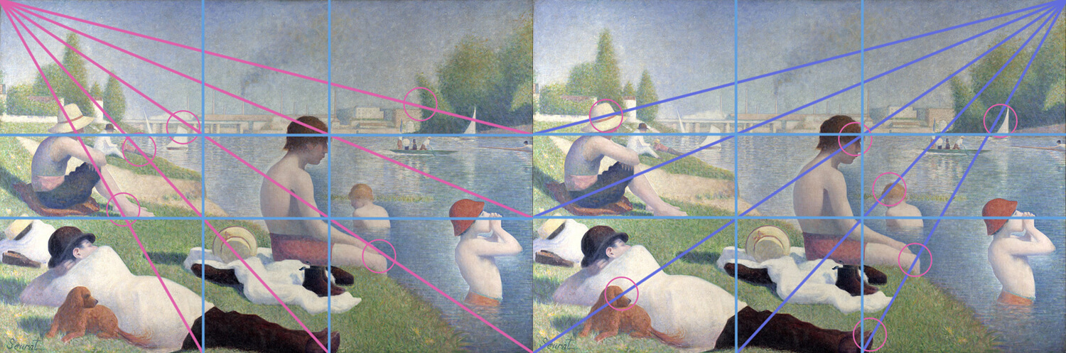
The following images show diagonal lines protruding from the edge of where the golden ratio lies, which tells an even greater story. Many objects, people and arrangements are geared up towards these lines – keeping the viewer inside the painting and enhancing the overall composition. I’ve placed circles to show you how the painting corresponds to these lines.
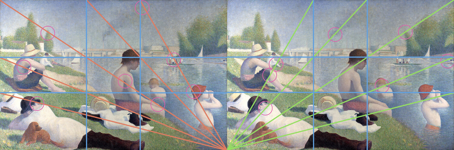
In terms of value, the darkest, most contrasted value areas are the boy’s hair, clothes and the man lying down. This is perhaps what Seurat wanted us to look at first, with the rest of the image containing mostly light and neutral halftones – with the darkest areas being the foliage towards the right.
Key takeaways – Position your composition to aid the artwork. Place your image on the golden ratio – from it’s vertical, horizontal and diagonal lines.
Right Angles In Compositions – At the Milliners by Edgar Degas
I admit that I’ve selected this painting by Edgar Degas, called ‘At the Milliners’, from a great composition book, ‘Composing your Paintings‘ by Bernard Dunstan (at the time of writing this, the paperback costs £20+, I’m not sure why it’s so expensive! I still recommend it though, but probably not for this price!).
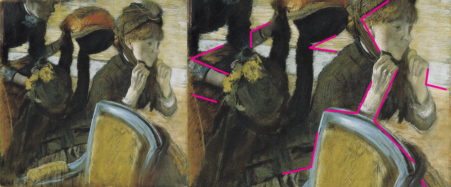
Now that admission is out of the way, this painting has strong composition because of its use of right angles. According to Bernard Dunstan, right angles are;
“…one of the oldest and most universally-used ways of strengthening the design of a picture, it has the effect of locking it together, one might say.” – Bernard Dunstan.
I couldn’t agree more. This painting keeps us ‘locked’ into the image, and I feel as humans, we have evolved to look for things such as right angles. We find them pleasing on the eye, and using several right angles in one image is ideal.
It’s important to note that the right angles used in Degas’ painting are very subtle. If you’re thinking about using right angles in your compositions, create a sense of realism to the piece by being subtle with it. You don’t have to conform exactly to right angles. If you conform too much to right angles and make it too obvious, it can make your images seem motionless – which is not what you want!
Key takeaways: Use right angles in your compositions to add appeal to the overall image!
Countercontrast – Mulberry Tree By Van Gogh
An article on composition has to include Van Gogh; an artistic and painting master. Known for his stunning landscapes and unique style, Van Gogh was also a fine composition tactician.
One technique that Van Gogh used in the painting ‘Mulberry Tree’, oil on canvas, 1889, is counterchange. If you’re unfamiliar with this term, this is where one silhouette is light against dark, and the other is dark against light (it can also feature more than one silhouette). James Gurney explains this very well on his blog. Here’s a quick sketch of the painting to show you what I mean;
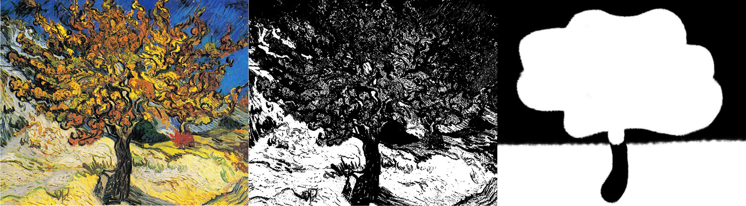
Counterchange is perfectly illustrated in this painting. You can see a rough drawing of the counterchange effect next to Van Gogh’s original, and I’ve also edited the contrast of Van Gogh’s original (I’ve made the values in this black and white version more prominent than in Van Gogh’s original – to show you the compositional idea behind this painting).
Can you see that the tree trunk is black against white, and the tree leaves above it are light against dark? This is counterchange in a nutshell. Counterchange is seen in nature, so there’s no surprise that this has been used within Van Gogh’s masterpiece.
But why does this compositional device work? I believe it’s because it makes for an exciting picture, and keeps you interested in the different shapes and tones. A pleasing image created with subtle reflections. So not only was he a painting and drawing master, he killed it with his compositions!
Key takeaways: Experiment with your image making to see what sort of compositional affects you can create!
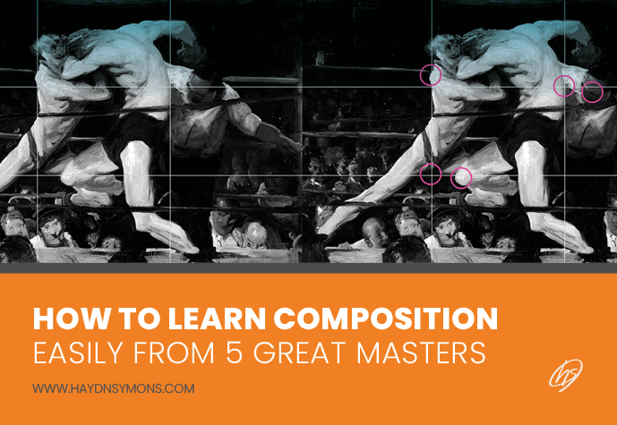
Rule of Thirds – Stage At Sharkey’s by George Bellows
I had to include Mr George Bellows in this article, who’s one my favourite painters of all time. Not just because he’s a personal favourite, but also for his fantastic compositions.
Within this painting ‘Stag at Sharkey’s’, 1909, oil on canvas, we can see that George has knelt heavily on motion, expression, and also the rule of thirds to construct the painting. If you’re unfamilar with the rule of thirds, have a look at my blog post dedicated to the subject. The sense of force comes through the painting like a hammer and offers depth. You can feel the power in the boxer’s punch, with the other boxer getting a full-on whack. When constructing your compositions, try and keep that sense of motion within the piece. Can you see how Bellows has constructed the figure to bring a sense of motion? The poses are exaggerated (recommended whilst gesture drawing), and these elongated shapes aid the design.
You can feel the tension in the legs, the arching of the back and the strong arms. This creates for an energising picture, with its dramatic shapes adding to the composition’s appeal.
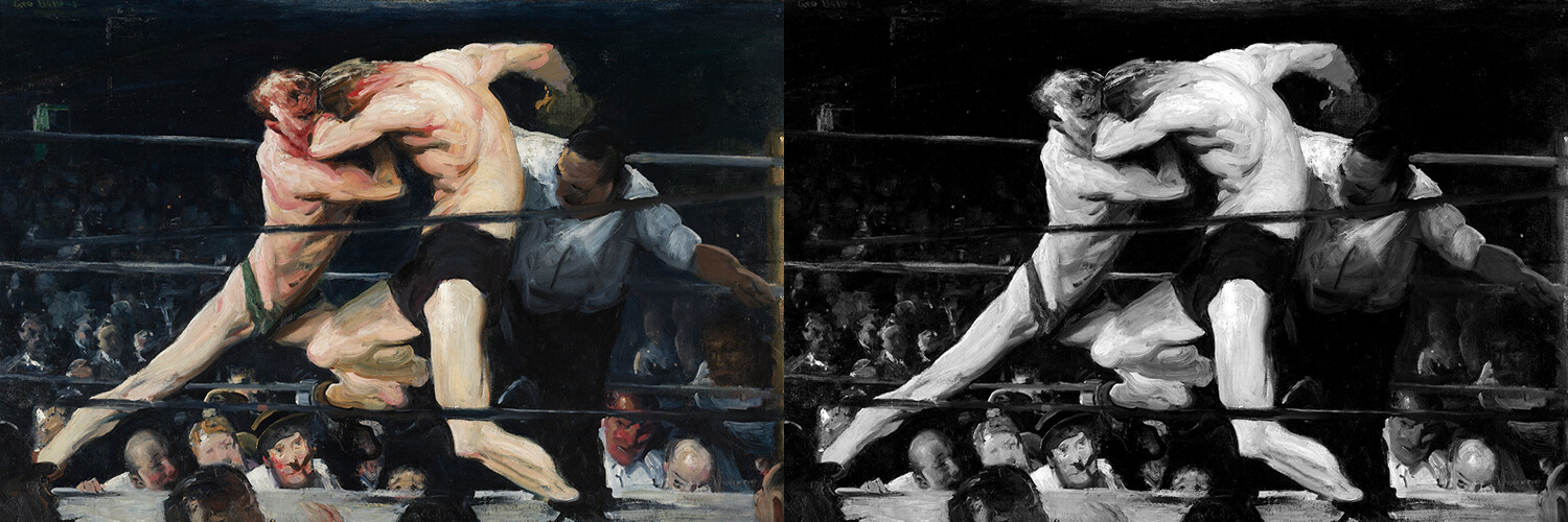
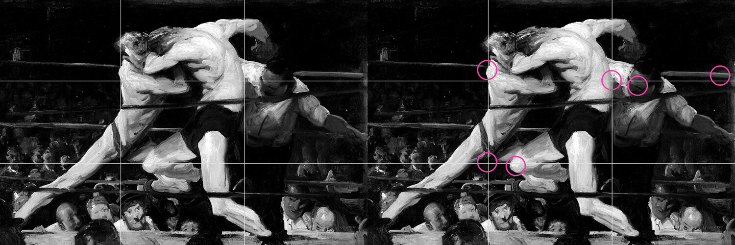
Another element that aids the composition is the tonal contrast (I love contrast in my own work, as it creates dramatic effects in my illustrations). Referring to the black and white version, the bright figures sit on a dark background, with only the referee, some of the crowd’s faces and boxing ring being the same value. This draws you into the centre of the piece, where Bellows’ wants you to concentrate. I’ve also placed a rule of thirds overlay on top of the picture, which shows how the figures correspond to this system. Both of the boxer’s backs falls on the vertical lines, and the referee’s face is inline with the top horizontal line. The horizontal lines of the boxing ring’s rope and knee also adhere to this too.
The boxing ring’s ropes also helps lead your eye around the picture – some adhering to almost vertical, whilst the other 2 offering interesting angles.
Key takeaways: Think about the tonal value of your compositions – use tones carefully to draw attention to the most important elements of your work. If you’re using figures in particular, think about motion and gesture. How can you imbed this into your artwork to create life? Motion doesn’t just correspond to figures either, see if you can create motion in everyday objects. Finally, use the rule of thirds to create interesting compositions – it’s a tried and tested system that rarely fails!
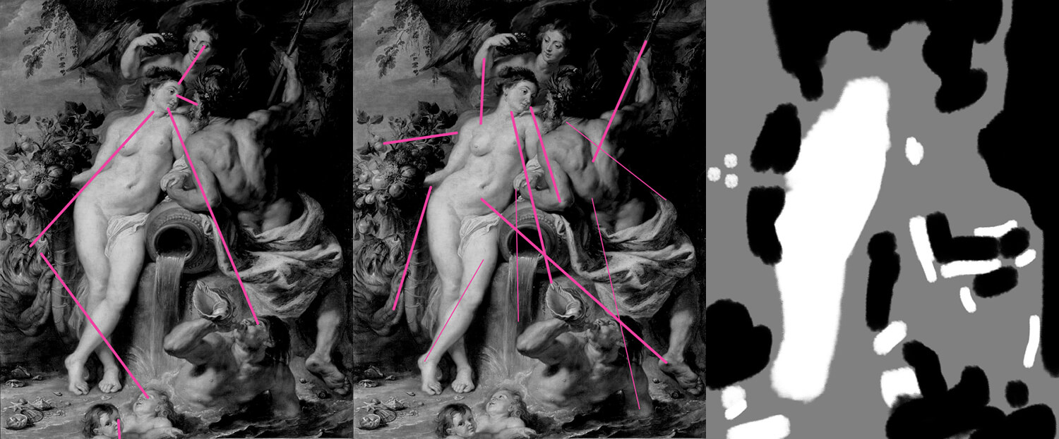
Curved Movement – The Union of Earth and Water by Peter Paul Rubens
The final artist and composition that I want to discuss is arguably one of the greatest of all time, Peter Paul Rubens.
Looking at ‘The Union of Earth and Water’, oil on canvas, 1618, this painting has movement, liveliness and motion. One particular compositional technique Rubens uses are swooping circles, which I’ve highlighted below. Can you see the circles being made throughout the piece, which draws your eyes around the picture?
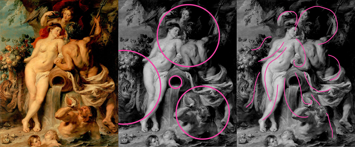
We’ve discussed right angles previously in this article, however, curved movements gives an impression of three-dimensional quality, weaving in and out of the picture frame. Take a look at this painting from London’s National Gallery, which further illustrates how curved movements was a vehicle which he exploited time and time again – and to good effect.
This composition makes us concentrate on the central figure. Everyone (and everything) is looking at her: the 3 other figures, one of the children and the lion. Not only are the figures glazing at her, limbs, objects and shapes are pointing towards her too. The shell, foliage, drapery, and some of the waves all point to this figure. The right-hand side of the picture is almost black in value and brings the figures to the forefront.
Using figures within compositions can lead to powerful results. Human beings are drawn to figures in pictures. When we see a human figure in a picture looking one way, or moving one way, our eyes follow. We see ourselves in these figures, and that’s why including figures in your art can be so potent. According to Bernard Dunstan, writing in “Composing your Paintings”;
“Again, a figure, or something which is moving or can move, which faces in one direction, will naturally lead the eye in that way. The more intense the movement – for instance, a gesture like a violently outflung arm – the stronger our reaction. Our response to any convincing and powerful human image is unconsciously to imagine ourselves copying the action.” – Bernard Dunstan.
From curved movement, using figures, to arranging shapes cleverly, this painting by Rubens is a fine compositional example. It’s a great painting to end this article on! I particularly love the portraits in this one – if you want to learn how to draw a face from any angle, I highly recommend this one.
Key takeaways: Use curves in your art to add to its appeal. This can give your art a sense of ‘motion’, and lead the eye around the piece.
How To Learn Composition: What Have You Learnt?
For me personally, I’ve learnt a lot about how these masters used fantastic compositions. I’ve discovered how clever these artists were to help influence us around their artworks. Point one way, curving another. They make it look so easy! One major thing they all do is have fantastic shape design. Making sure every shape they paint is great in itself. Here’s a quick roundup of our key takeaways;
- Golden ratio – place your arrangements along these vertical and horizontal lines
- Rule of thirds – like the golden ratio, place your elements on these lines
- Right angles – Use 90 degree angles to create appeal to your work
- Curved movements – how can you get a sense of motion into your piece?
- Countercontrast – black on white and white on black
Like any painting, it’s not just about the composition that makes a piece. It’s about the motion, the style, skill to colour – which composition plays an important role.
I’ll love to discover how this blog post, on how to learn composition guide has helped you. Are there any compositional masters you love who I haven’t mentioned here? Is there anything I’ve missed within this article? Pop me a comment below, I’ll love to hear from you!
If you like this blog post, do share it with your friends on social media! Connect with my on the links below, take a look at my illustration portfolio, or check out my other blog posts!
Cheers guys, and see you on the next post!
Many thanks for listening and visiting my news page today. You can follow what I’m up to on my Twitter, Facebook or Instagram pages, I’ll really appreciate it if you do, and don’t be afraid to say hi to me! Many thanks again, and have a great day!
 28th November 2020