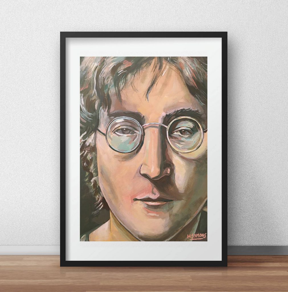
What better way to improve your colour by learning from famous colour palettes?
Colour is the first impression when someone looks at your art.
Whether you’re a designer, fine artist to illustrator, colour plays a crucial role.
The most famous past and present artists have utilised colour to create masterpieces. They’re usually artistic classics for their skill, composition, and what we will be discussing today, colour.
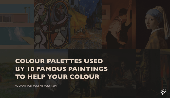
Within this blog post you’ll discover ten famous colour palettes the artistic masters used. You’ll discover their colour schemes, you will learn the colour analysis of each artwork, and how colour helped their compositions. This deep dive into these famous colour palettes can improve your own colour theory, as you’ll see exactly the methods behind the genius.
The list below looks at famous past and present artists such as David Hockney, a classic Rembrandt artwork, to Claude Monet.
If you’re new to colour, check out this article on how to use colour. Perfect for colour beginners to grasp colour. It’s a great place to start. Otherwise, my other guide can help you understand the colour wheel. Which I will be touching on here before the deep dive begins:
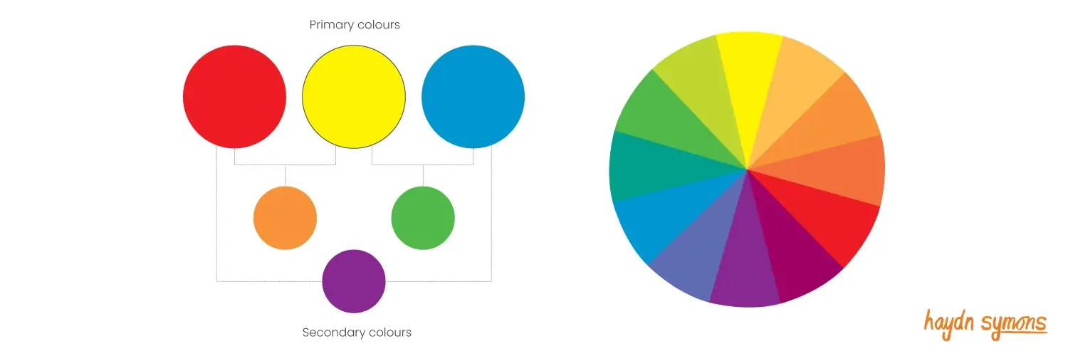
Before talking about famous colour palettes, lets begin with the colour wheel. The colour wheel is the backbone of colour theory.
If you’ll rather watch instead of read, check out my video on The Portrait Guru YouTube channel, with how to improve your colour skills by learning from the masters!
The Colour Wheel
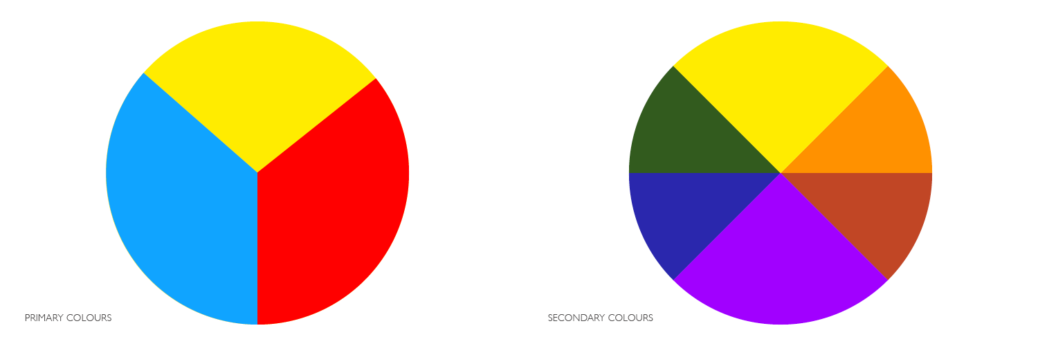
Primary colours form the colour wheel. This consists of red, yellow and blue. Secondary colours result from these primary colours. There’s also tertiary colours, that sit inbetween a primary and secondary colour in the colour wheel. The colour wheel is what most artists choose their colour. However, as you will find out, it’s the colours that you don’t select that are the most important.
These paintings derived from the colour wheel, selecting different gamuts to paint with. A gamut is a term that describes the selected area from the colour wheel that an artist can paint with. Essentially it’s a limited colour palette.
Girl With A Pearl Earring – Johannes Vermeer (1665), Oil
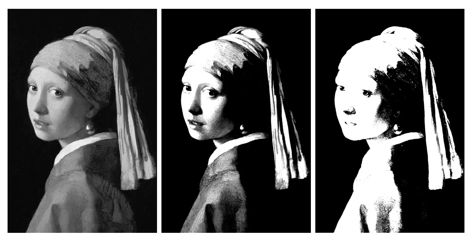
A dark blue-grey background surrounds the figure, with a warm and earthy colour palette used for the figure. Notably, Vermeer uses red for the lips, and a distinct blue for the scarf. You may notice that red is only used for the mouth, which Vermeer used to his advantage. Red stands out, as it’s different from the rest of the painting, our eyes keep circling back round to this facial feature. This is a prime example of how colour aids composition. I discuss how you can learn composition from the great masters, it’s a recommended read (if I say so myself). This is an excellent composition, as your eye wonders all around the artwork.
Using a mixture of light and dark blues for the head scarf, this draws the eye into the centre. Viewers look at her face, her lips and of course, her pearl earring. A classic technique used in 17th Century paintings was to place light toned subjects on dark backgrounds. Why is this the case? To make the subject stand out. The edge of the subject is a hard edge, almost looking like a Photoshop mask! See how Vermeer groups the tones into groups, as shown in the image below. The left image is a desaturated version, whilst the middle showcases three tones, and the right, a stark two toned version.
The colour gamut for this painting sits at the top of the colour wheel. Vermeer used a colour gamut of blue, yellow, red and orange.
Top five RBG HEX values for the painting
- #040310 – Dark blue (background)
- #DEBDA6 – Light pink (skin tone)
- #657B9D – Light blue (head scarf)
- #9F463B – Red (mouth)
- #E5C68E – Cream (head scarf)

David Hockney – A Bigger Splash (1967), Acrylic
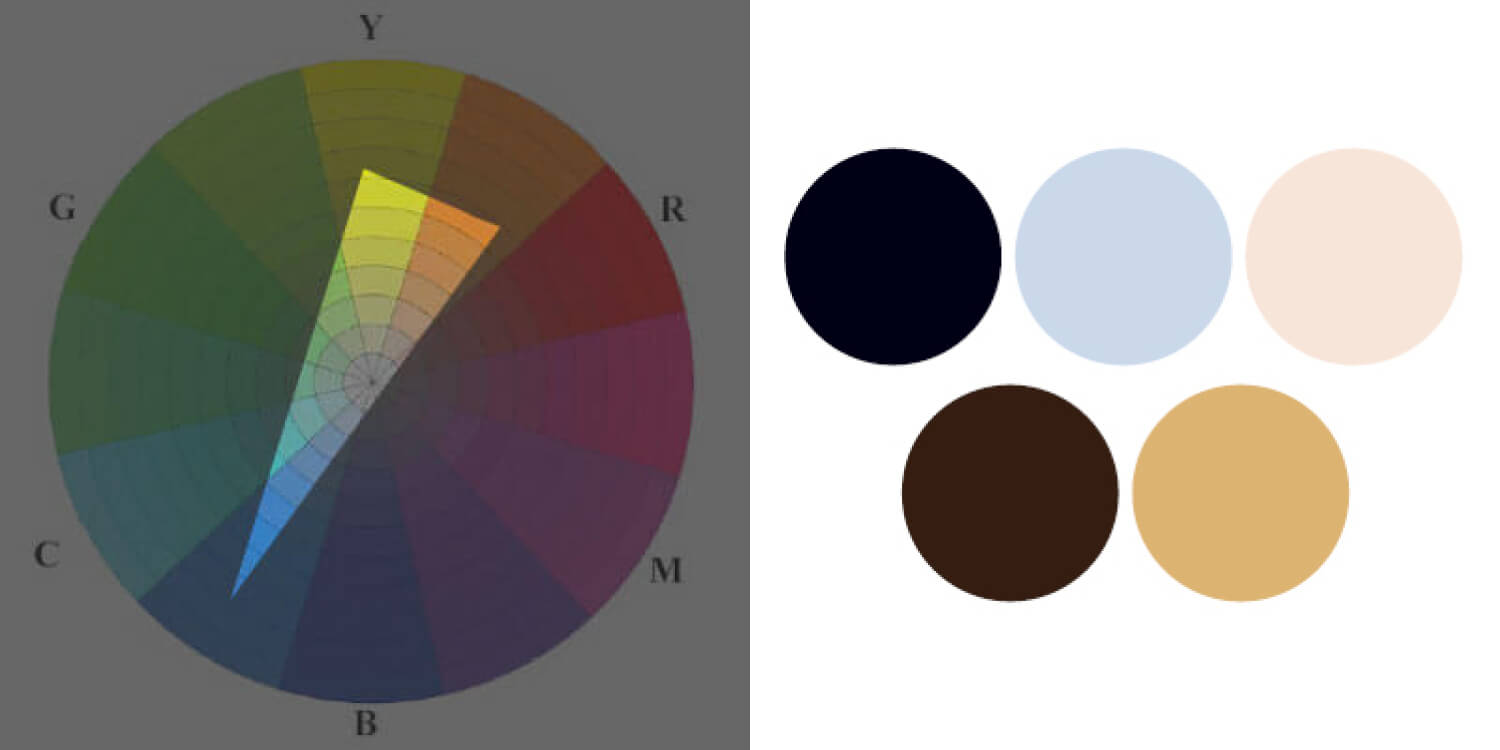
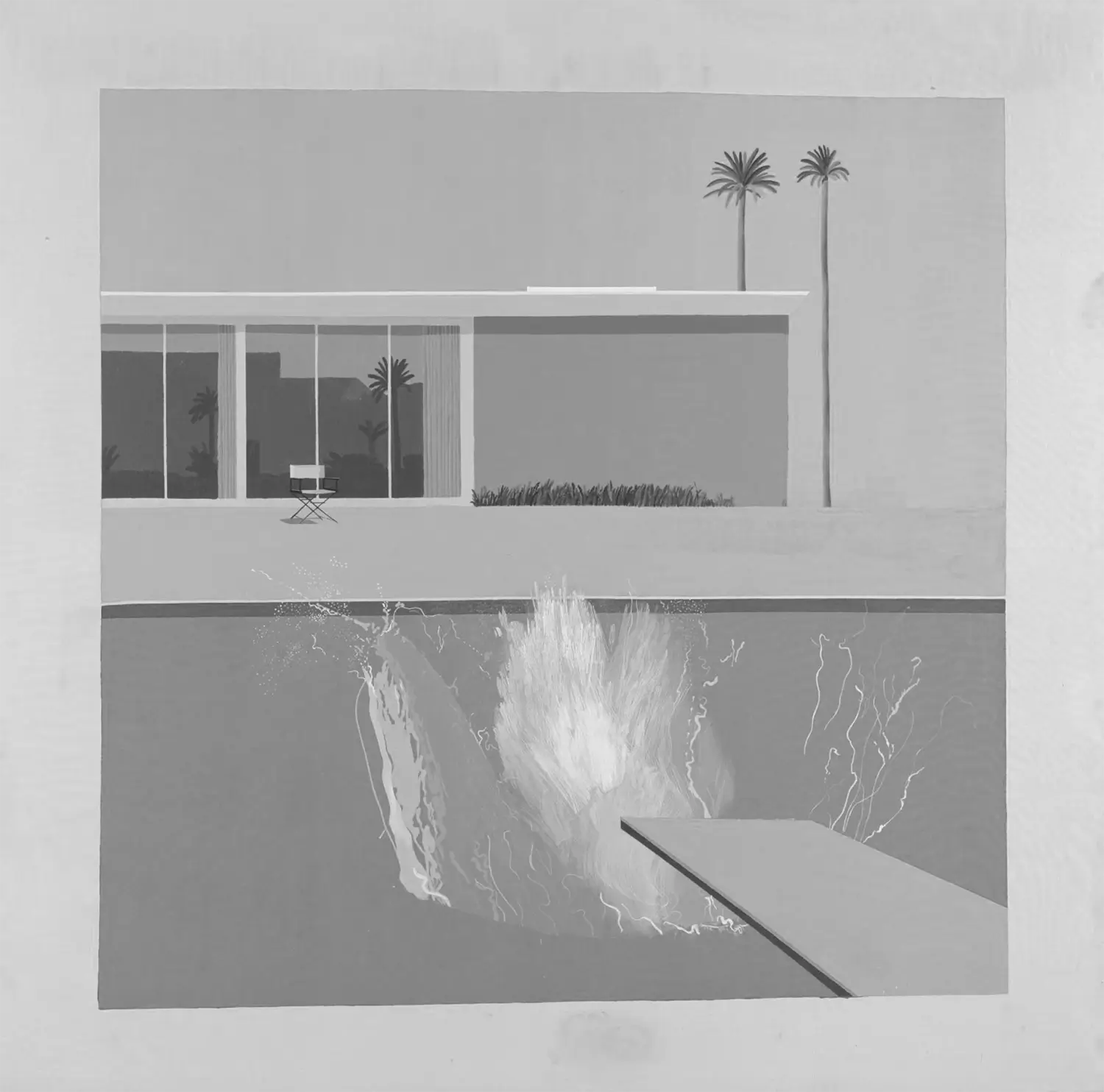
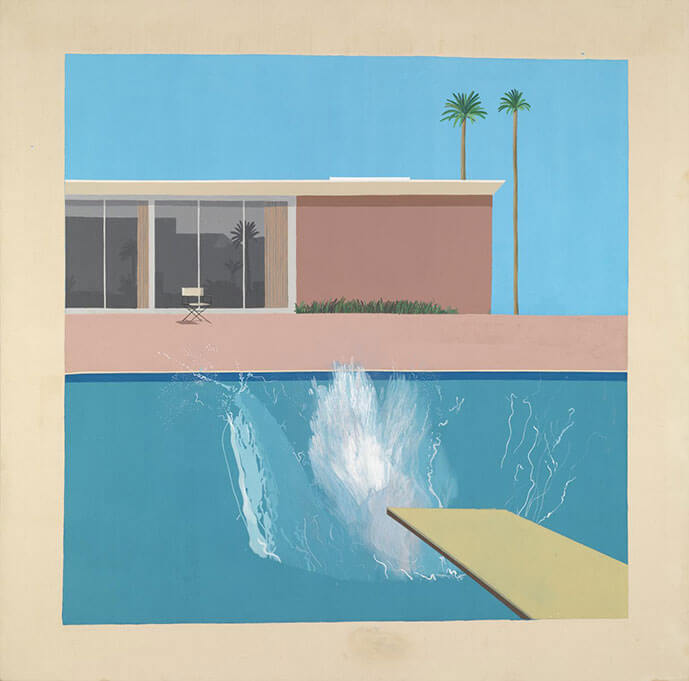
David Hockney is one of my favourite artists, and he’s used one of the most interesting gamuts within this famous colour palettes collection. In this landscape artwork, Hockney uses blue as the dominant colour. With the addition of brown-red and green-yellow, these colours are neutral, with the most saturated part of the image arriving from blue. The blue used for the water is almost a green-blue.
David Hockney once explained, on the Tate’s website:
“When you photograph a splash, you’re freezing a moment and it becomes something else. I realise that a splash could never be seen this way in real life, it happens too quickly. And I was amused by this, so I painted it in a very, very slow way” ~ David Hockney
This colour gamut focuses largely on the blue hue, with tints of yellow, red and green playing a part too (with tones in-between). You can also see that Hockney has used grey for the windows – to make sure the building’s colour doesn’t dominant the painting.
From the unsaturated version of the image, the tones are mid-tone. The splash and top of the house s the lightest part of the image. If we break it down into three values, and then two, we can see the emphasis is on the splash and ground level.
Top five RBG HEX values for the painting
- #6598B0 – Blue (pool)
- #C6AFA6 – Cream (ground)
- #E2E2E0 – Off white (splash)
- #4F745F – Green (trees)
- #C8BF96 – Green / Yellow (diving board)
Balance and harmony echo through the piece, with the big eruption of the splash at the heart of the painting. Blue compose the sky and pool (avoiding a top or bottom heavy image), with earthly tones in the centre. Similar to Vermeer’s painting, using yellow only for the diving board, attracting our eye, therefore leading the eye off the board to the splash – the core part of the painting. It’s a fine piece of art by the legendary artist.
Key takeaways: Earthly, dirty and grey colours are your friend! Artists tend to avoid over saturated or undersaturated paintings, using a mixture of both. This creates the perfect combination.


Vincent Van Gogh – Cafe Terrace at Night (1888), Oil
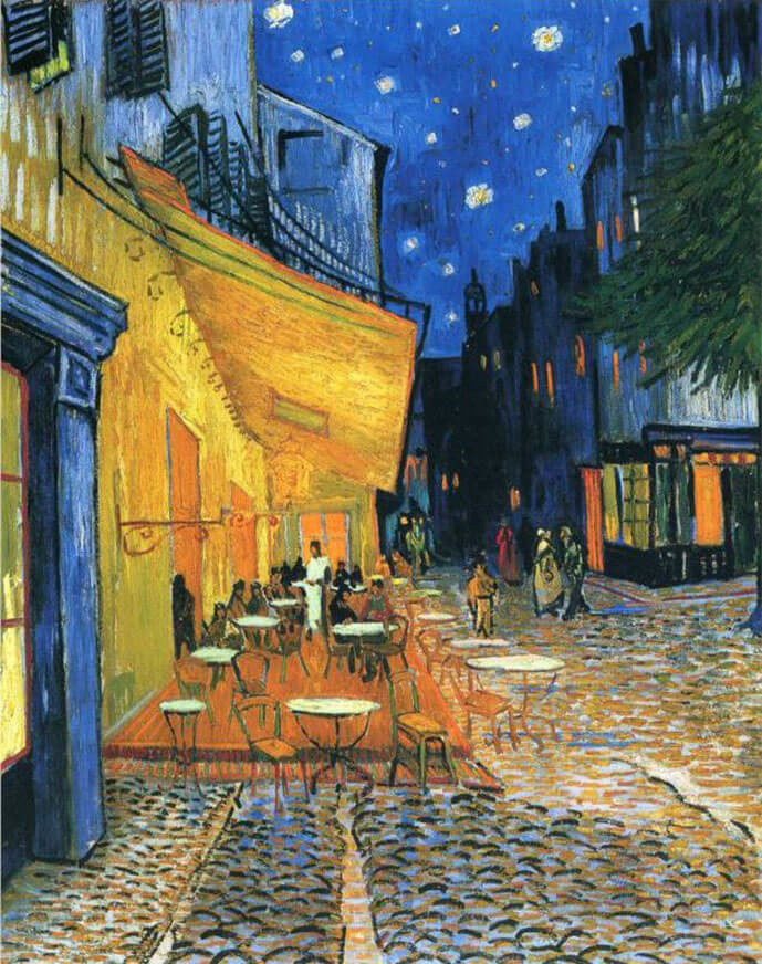
Van Gogh uses complementary colours of yellow and blue, with hints of both green and red-brown. Limited colour palettes reveals just how popular this colour scheme is. The previous three artists used a limited colour palette, as it works every time!
Saturated colours forms this painting, with the assistance of grey-blue to counteract. The gamut for this piece is a diamond shape, with the focus on blue and yellow.
From the desaturated or black and white version, Van Gogh uses dark lines and shapes to draw our eyes on the essential elements of the image. Tones, composition and colour are closely linked, and should be viewed together. He paints a dark outline around the terrace, in contrast to the lighter warm hues. This simple line draws out eye to the centre of the piece. A white dressed waiter stands out as dark figures surrounds. The top of the buildings covey the nighttime skyline of the time.
Five RBG HEX values for this painting
- #314F94 – blue (sky)
- #EAC655 – yellow (terrace)
- #0C1418 – dark blue (buildings)
- #BC734A – brown (floor)
- #EFE8DF – off white (street)
You can see that Van Gogh has used a dominant block of green for the tree on the right hand side. Not only does the shape lead the eye to the centre of the composition, it breaks up the yellow-blue colours throughout the landscape artwork.
Key takeaways: Create a sense of warm and cold equally in a painting by using two complimentary colours of yellow and blue. They are pleasing on the eye and look great together.

Rembrandt – The Night Watch (1642), Oil
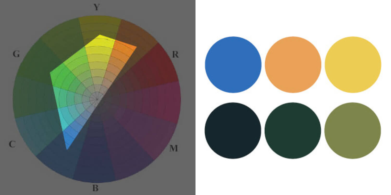
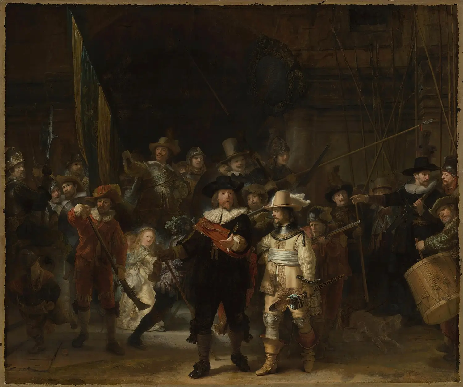
Rembrandt painted well over 600 paintings and drawn 200 drawings in his lifetime. He must have had his daily drawing habits absolutely nailed! In this remarkable painting by Rembrandt, he concentrates earthy tones of brown, dark green, with the adjacent of yellow and red.
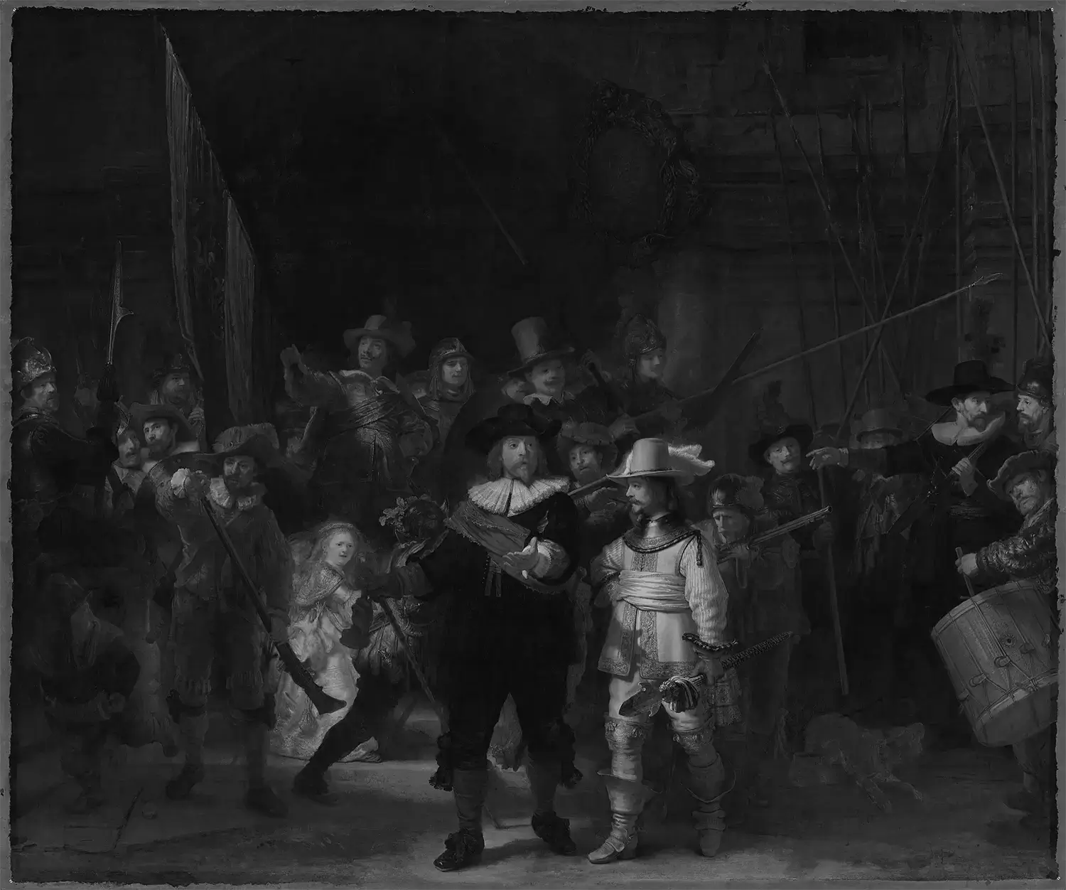
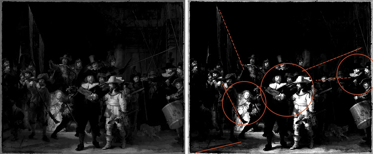
This clever painting and shows you how a painting’s colour works closely with composition. It helps tell the story. Do you notice when you look at the painting, you’re drawn to the male bearded figure in the centre, and then the yellow girl in the background, to the left of him?
Rembrandt didn’t do this by accident, and used saturated colour to draw the eye. The girl protrudes against a dark surrounding, bringing out her colour and intensity even more. The central figure wears an bright orange-red piece of clothing, a similar colour to the man cleaning his gun to the left. Orange is only used within these sections, which draws the eye even more. Coupled with the fact that all elements point to the girl. The flag, limbs, the arquebus, all pointing to where Rembrandt wants you to look. It’s a deliberate arrangement.
Here’s the top five RBG HEX values for the painting
- #181310 – dark brown (background)
- #AF9F71 – light cream (girl)
- #703D23 – orange (sash)
- #79684B – mid cream (skin tone)
- #B1A17D – off white (ruff)
It’s a great way to learn how to paint effectively, as like I’ve said previously, composition, tonal values and colour go hand in hand. When you choose colours, think of them not only as colours and saturation, but also their tonal values. How can you draw the eye with placing dark on light and light on dark? The colour wheel for this piece sits in the top right-hand corner of the wheel, using mostly earthly tones with reds and oranges.
Key takeaways: It’s simply a brilliant masterpiece. The more you look at it, the better it gets. Colour transforms paintings, and shows you how important colour is. For a painting to be successful, the colours used doesn’t have to be garish, saturated or varied. From this example, Rembrandt sticks with earthly tones, all similar in saturation.
Pablo Picasso – A Girl Before A Mirror (1903), Oil
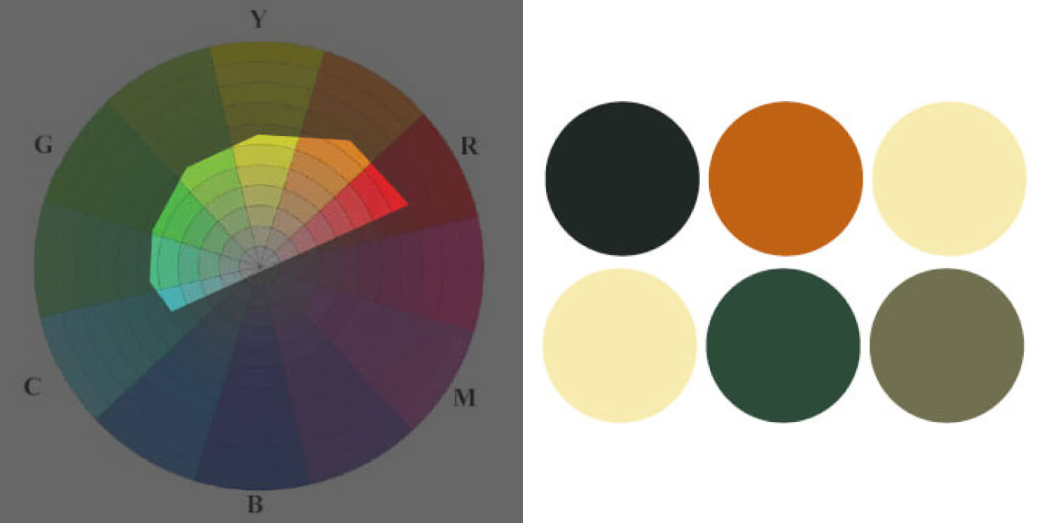
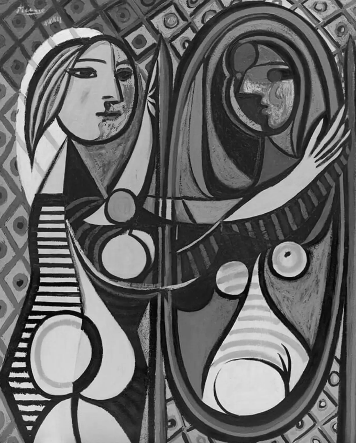
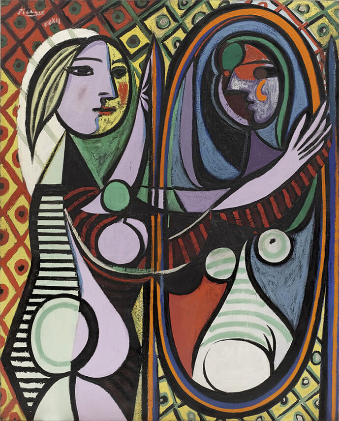
Pablo Picasso, one of the most famous past and present artists. Love him or hate him, he was one of a kind, which all artists can learn painting techniques from. Orange, green, purple, yellow and red are all used within this piece. In contrast to the examples above, this artwork doesn’t have much of a gamut. It’s large within the colour wheel. Even though this is the case, it still seems to work well.
But why is this?
The trick here is the subtle grey, unsaturated colour. This balances the entire piece. If Picasso used very saturated colours throughout, the piece would look garish and too much on the eye. This is the danger of using a lot of colour. However Picasso, as you would expect, handles this with ease. It’s far from garish, which makes it work.
Colours throughout the painting lead the eye and keep the viewer interested in the artwork. He uses lots of colour, however Picasso uses the exact same colour too. For example, light purple for the face, arms, parts of the mirror and also the body. They are the same colour and don’t differ in hue, saturation or tonal value. I try and use this technique with my own portrait illustrations.
Top five HEX RBG colour values:
- #BEB3C2 – Purple (body)
- #7BA081 – Green (body parts)
- #CBBE6F – Yellow (background and face)
- #9F533E – Red (background and body)
- #677894 – Blue (mirror)
Key takeaways: If you want to use a broad colour palette, grey, subtle and unsaturated colours are your friend. Use bright colours sparingly.

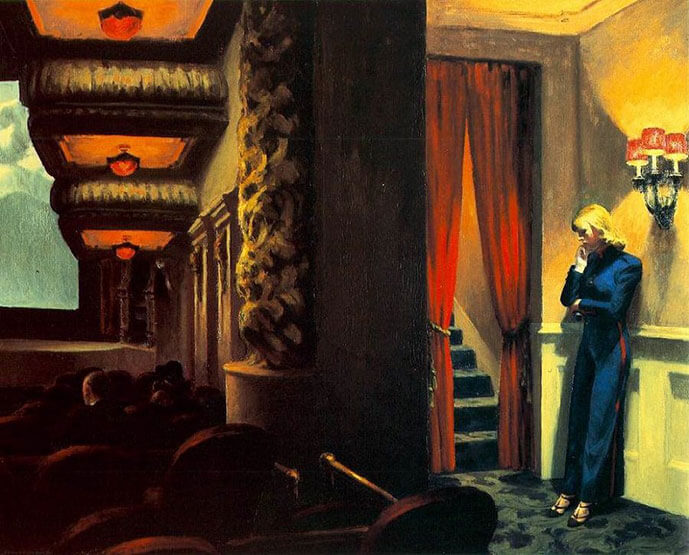
Edward Hopper – New York Movie (1939), Oil
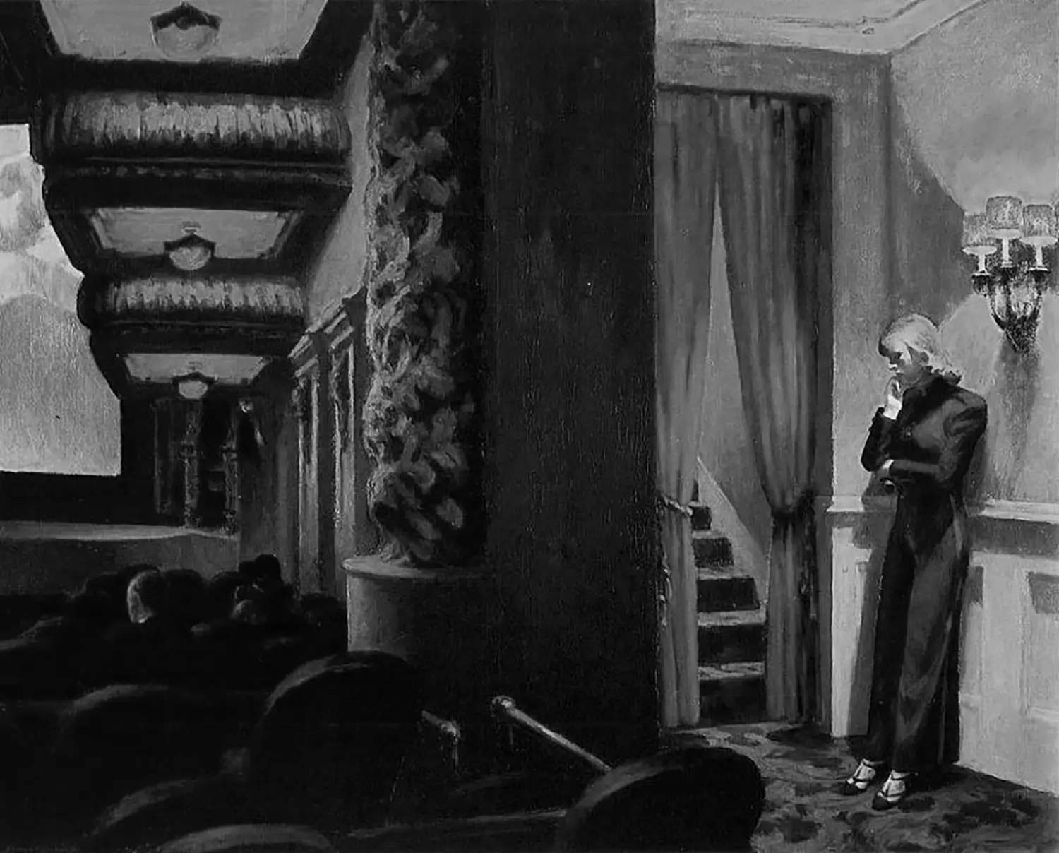
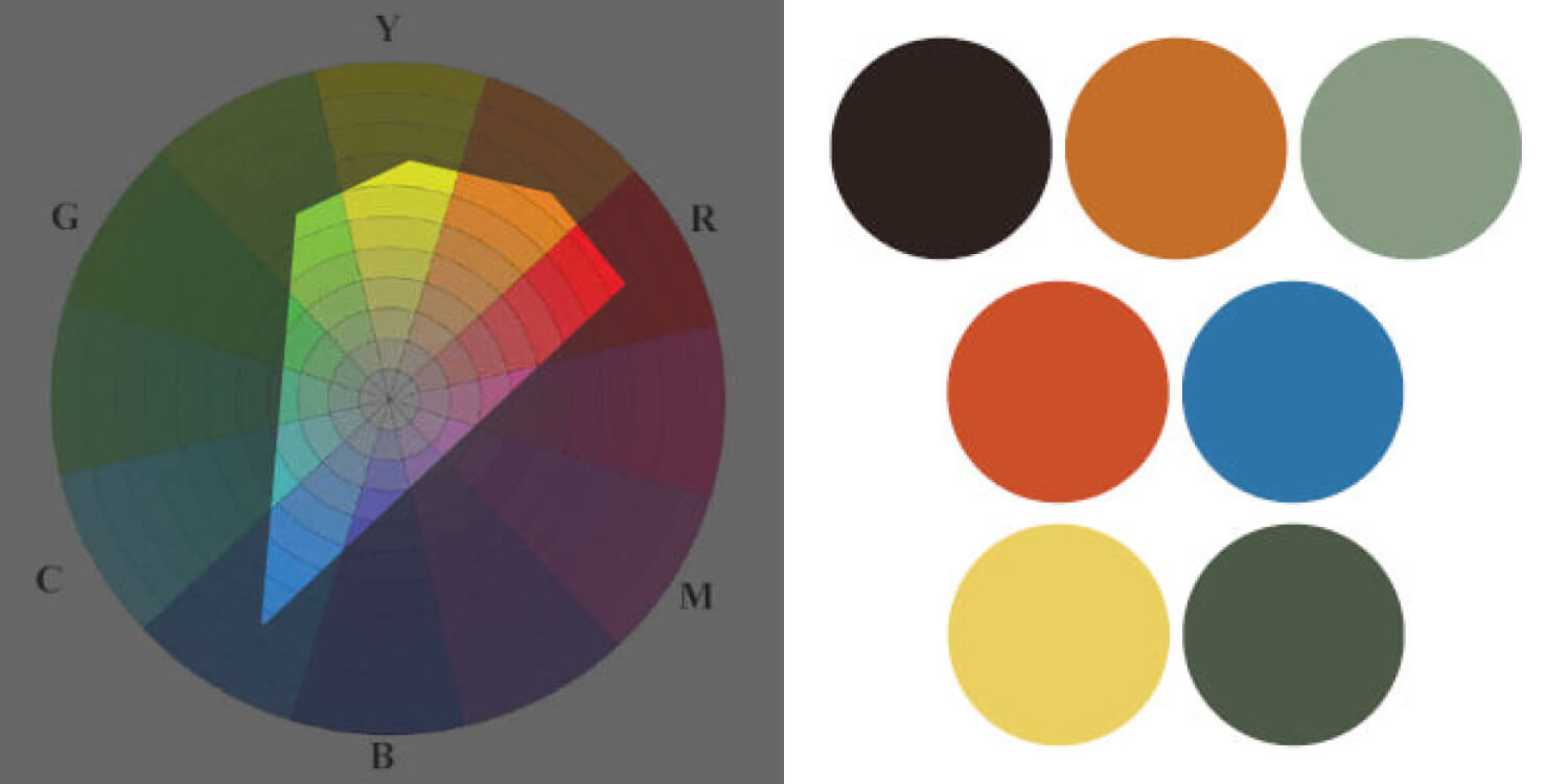
This is an amazing piece of art for it’s painting skill, composition and colour. Perspective plays an important role too, drawing the viewer to the woman on the right. The horizon line sites roughly just below centre. The piece houses four main colours of blue, red, yellow (a grey-yellow), and orange (a grey-orange).
Selective colour helps the composition of the piece. The woman’s blue clothing stands out amongst the yellow. This is the only part of the painting which houses this deep blue colour. Notice that the tones helps the woman stand out amongst the light background too. We’re drawn to the movie screen and the woman’s clothing. The colour gamut is further down the wheel, with more emphasis on blue, red, some cyan and yellow.
Top five RBG HEX values
- #413332 – Brown (interior)
- #1E6CB4 – Blue (woman’s clothing)
- #F9D83D – Yellow (lamp)
- #D91200 – Red (curtain)
- #EA5006 – Orange (ceiling lights)
You may notice the most saturated part of the image comes from the right; the woman’s clothing, but also the bright yellow projecting from the wall lamps. This leads the eye to the concerned woman. Hopper is certainly one of my favourite artists within this famous colour palettes list, for his paintings but also for his fantastic sketchbook drawings.
Key takeaways: If your painting concentrates on natural and grey colours, use saturated colour to lead the eye to your focal point.
Claude Monet – Wheatstacks (End of Summer), 1890 – 1891, Oil
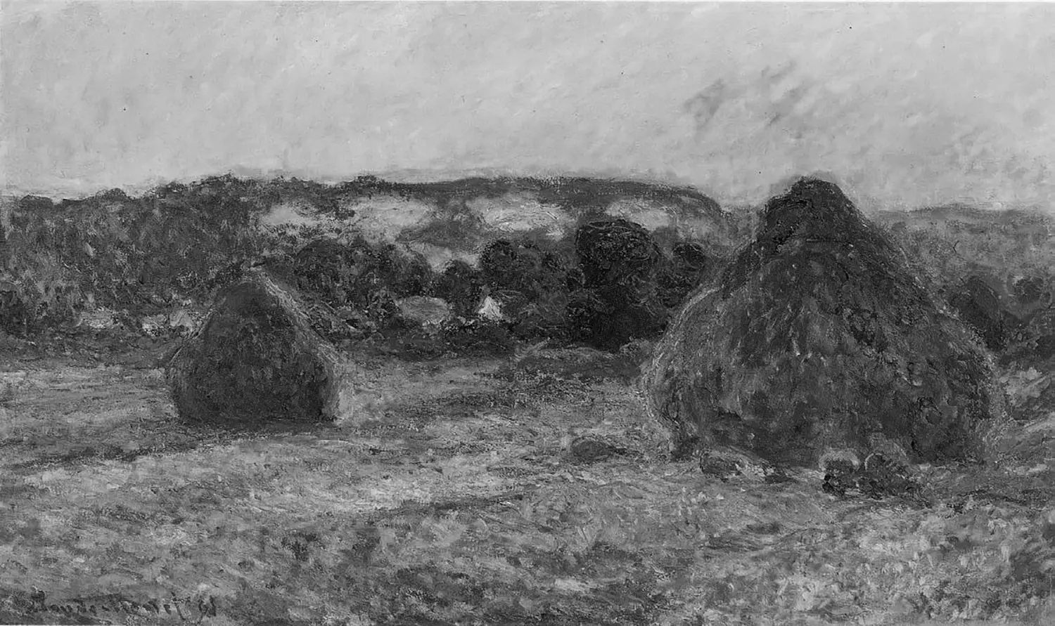
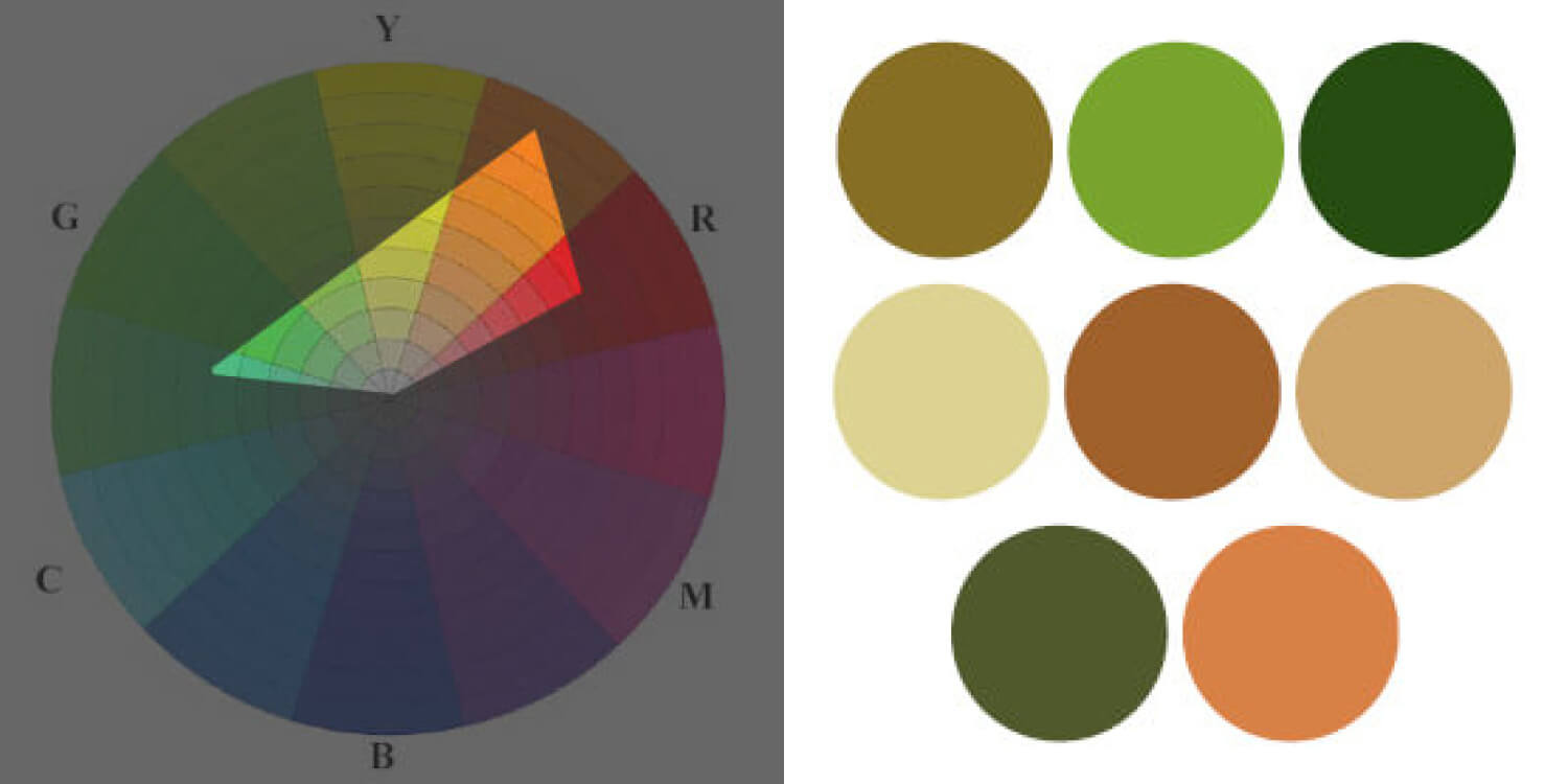
This classic Monet painting uses superb colours throughout. His use of colour has helped improve my map illustrations in particular, and he is one, if not the most, famous impressionist artists ever. Monet uses earthly tones of red-brown, yellow-green, green, light blue and yellow.
When you think of light and dark, or that of dusk, you may think of black and white in basic terms. However this painting contradicts this entirely. Green colours make up dark tones, the haystack’s shadows portray light blue-green, with the light from the yellow-pink.
You get a real sense of warmth after a hot Summer’s day, which these colours communicate magically. Similar to Vincent Van Gogh’s colour palette, Monet uses a diamond shape from the colour wheel, with emphasis towards blue, yellow, green and some red too. Monet is a master of colour and light, and he’s a big inspiration to me when building my illustrator portfolio.
There’s some contrast within the unsaturated tonal range, with the lightest from the sky, and the darkest areas coming from the trees in the background.
Top five RBG HEX values
- #DBE0A6 – Light green (sky)
- #887D09 – Mid green (background hills)
- #513800 – Dark brown (haystack)
- #B19B38 – Yellow / orange (ground)
- #A23B00 – Red (haystack highlight)
Key takeaways: Think outside the box. Instead of using black for shadows and white for light, what other colours can you use to convey the same meaning?

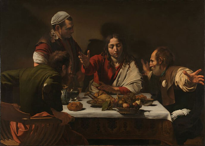
Caravaggio – Supper At Emmaus (1601), Oil
Caravaggio, the 17th Century master, who’s painting style is out of this world! He’s certainly one of my favourite artists of all time. What better way to admire this painting is with this resource by The National Gallery, where you can zoom right into the artwork.
“On the third day after the Crucifixion two of Jesus’s disciples were walking to Emmaus when they met the resurrected Christ. They failed to recognise him, but that evening at supper he ‘… took bread, and blessed it, and brake and gave to them. And their eyes were opened, and they knew him; and he vanished out of their sight’ (Luke 24: 30–31).” ~ The National Gallery
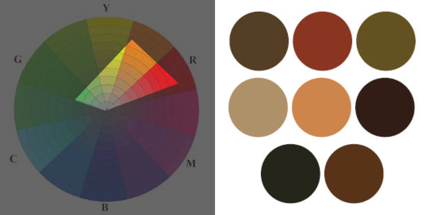
Like a lot of painters we have discussed in this famous colour palettes article, earthly colours make up the majority of the painting. With particular focus on complementary colours of green, red, orange, red-brown, and a little hint of red-green too. The colour gamut forms a diamond shape pointing horizontally, with a focus on green, red, some blue and yellow.
Complimentary colours of red and green work excellently, with dark earthly reds-browns used as the background.
Red is the main focal point from the central figure’s clothing, with warm earthly tones used as a compliment. Like most of the other paintings with this article, red draws the eye to the centre of the piece. Similar to that of Rembrandt, Caravaggio places light figures on a dark background. This makes for a tonal range which is stark, working perfectly to describe. the ambience of the piece. Check out this master study of this expert painter!
Top five RBG HEX values
- #2A1F13 – Dark brown (background)
- #792617 – Dark red (clothing)
- #C37737 – Cream (skin tone)
- #AC9B7D – Off-white (table cloth)
- #453717 – Muddy green (clothing)
Key takeaways: Instead of using black pigment to form your shadows and dark areas, use a selection of colours like blue, red and brown.

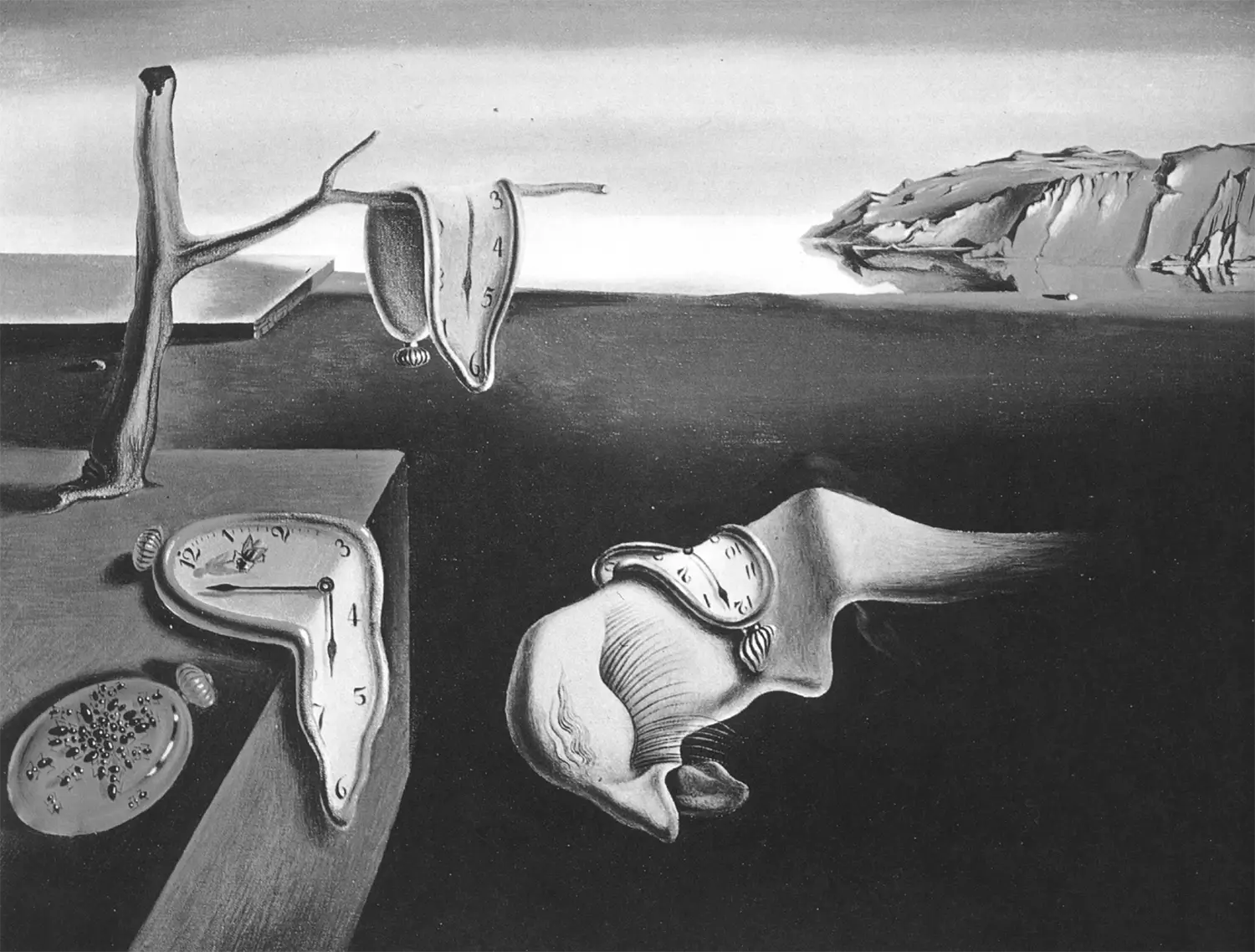
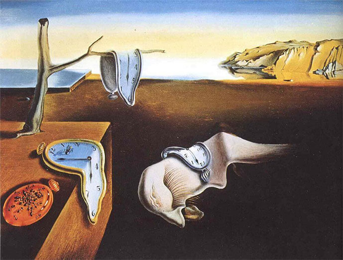
Salvador Dali – Persistence Of Memory (1931), Oil
Blue and brown feature heavily in this painting, with an adjacent of orange-red, yellow and subtle yellow-green.
Dali uses a diamond colour gamut, with one stand-alone orange protruding from the left hand side. This piece goes to show you how unsaturated, earthly tones, and strong colour theory can improve your paintings.
But what is Dali trying to convey with the use of colour? The clock faces are blue, and in psychology blue refers to trust, wisdom, depth and heaven. The iconography used may refer to one of Dali’s dreams, or the time passed during a dream – do you think the colours represent this?
Top five RBG HEX values
- #2B251F – Dark brown (ground)
- #96B2DF – Blue (clock face)
- #E1B662 – Cream / yellow (cliffs)
- #EBE8E5 – Off-white (white object, perhaps a profile)
- #9B6845 – Brown (table)
Key takeaways: From red for passion to green for envy, use colour within your art to communicate a message.
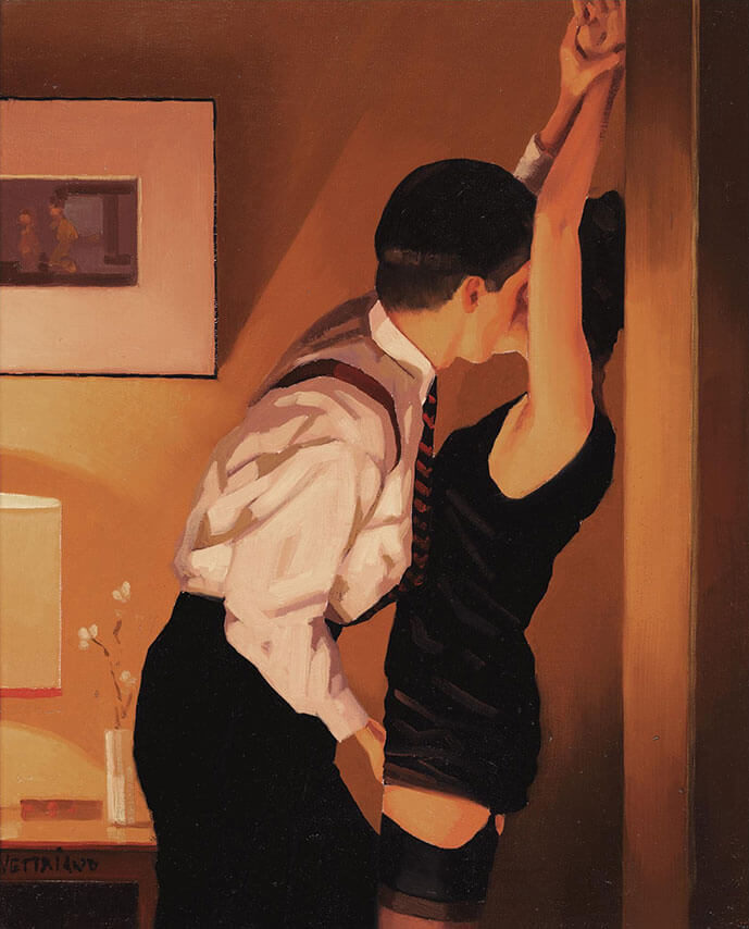
Jack Vettriano – Game On (2006)- Oil
I’m not sure why critics seem to hate and detest Jack Vettriano, but I love him – so I had to include him in this blog post. Not only is he great at landscapes, he’s fantastic at figurative and portrait art. Warm, passionate and lust filled colours communicate the painting’s subject effortlessly.
The piece mainly uses red and warm colours of brown, light brown-red, yellow-brown, red-black, with cream in the mix too.
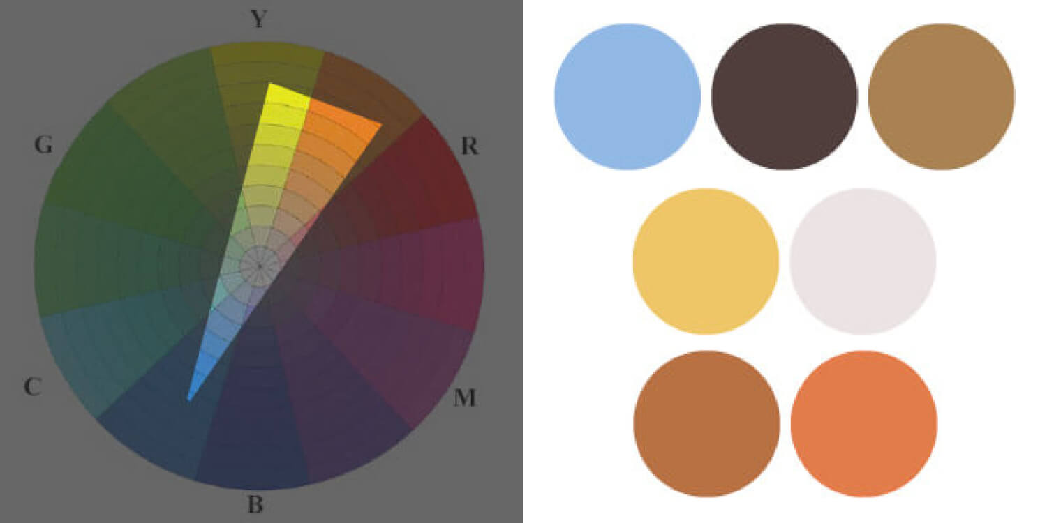
The colour gamut on the colour wheel concentrates on the warm spectrum, with little hints of yellow and magenta to act as a counter-balance.
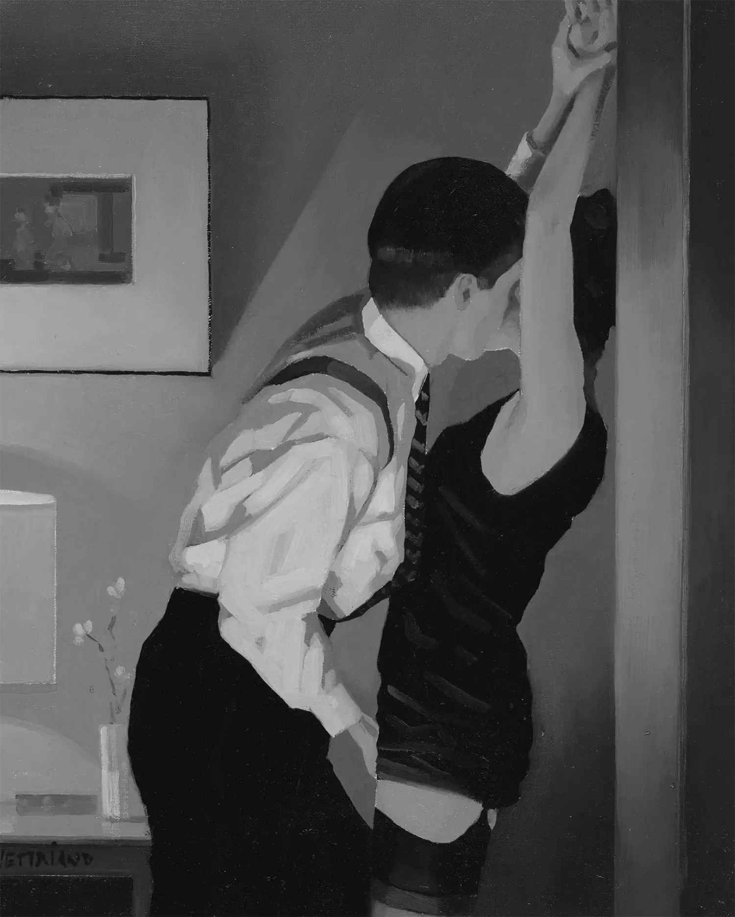
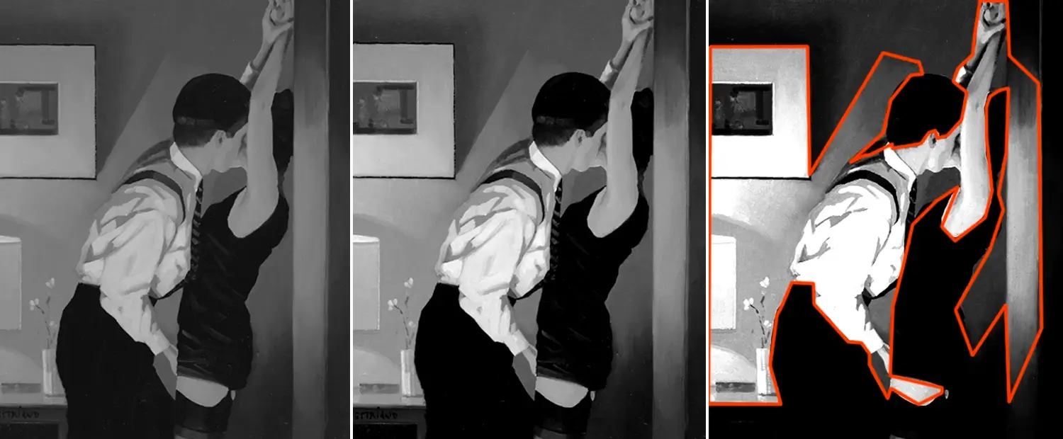
Notice that if you squint your eyes (used to help artists see tones), the female’s clothing, hair and the man’s trousers pop out from the light background. Even though it looks like black, it’s a very dark brown. As it’s situated next to a light tone, it makes the dark tone even darker. Remember, that no colour sits by itself, and every colour affects one another. This black colour is an interesting contrast to the warm colours used throughout. If you’re having trouble seeing tones of an image, bring the artwork into Adobe Photoshop (or equivalent software) and turn the saturation down to 0%. You can then up the brightness and contrast, or the leave the image as it is. It’s my favourite tool to help me see tones when I can’t do it naturally with my eyes.
Top five RBG HEX values
- #121011 – Black (clothing)
- #D7B797 – Off-white (shirt)
- #BE8E5B – Cream (skin tone)
- #B36E44 – Red / brown (wall)
- #563022 – Dark brown (wall shadow)
Key takeaways: When arranging colour for your painting, always think of this phrase: ‘no colour sits alone’. Every colour interacts with another. For example, a light yellow looks completely different when used on top of a dark red background to that of a light orange background.

What have you learnt from these famous colour palettes?
We’ve covered a lot of ground in today’s famous colour palettes article. From Van Gogh, Rembrandt to David Hockney, see the colour palettes that they use and let the inspiration flow (or simply steal their colour palettes). I take huge inspiration from these artists, which runs right through my illustrations. I hope you’ve learnt how these artistic geniuses used colour to create their own masterpieces.
As we’ve covered a lot, lets run through what we’ve learnt.
In conclusion
- Limited colours and a thoughtful colour gamut makes for strong colour within any painting.
- Grey is your best friend: Notice how many of these artists used saturated colours. The answer? Not many! These artists carefully selected earthy colours, neutral colours and unsaturated colours to create their masterpieces.
- A diamond colour gamut is popular with these fine art paintings, commonly using blue, yellow, with a hint of green and red.
- Complementary colours are an important colour scheme to remember – they are easy on the eye and also eye-catching too!
- They all have a deep knowledge of the colour wheel. They understand colour gamuts, what colours work well with each other, and concentrate their colour palette.
- These artists used colour within their paintings to lead the eye and create stunning compositions. Shapes, lines, and tones aid compositions, as colour plays a critical role.
I hope you have enjoyed this famous colour palettes blog post! It was very fun to learn more about these painters, see their use of colour, and discover their own use of colour. If you liked this blog post, check out my other article helping you discover the golden ratio and how it can improve your compositions. Alternatively, discover analogous colours, how it can boost your colour theory and much more!
What do you think of these famous colour palettes?
I’ll love to hear from you, so do comment below with your thoughts on these colour gamuts, the colour that you use within your art, or any classic paintings that I may have missed.
If you don’t know much about me, I’m an Illustrator and Designer, and you can check out my illustration portfolio. Or if you would love to improve your drawing skill, check out these drawing exercises to help you improve!
Many thanks for listening and visiting my news page today. You can follow what I’m up to on my Twitter, Facebook or Instagram pages, I’ll really appreciate it if you do, and don’t be afraid to say hi to me! Many thanks again, and have a great day!
 12th January 2019
