Do you want to take your illustrations, designs or artworks to the next level?
Can’t get your head around what makes up good colour?
Don’t worry, we’ve all been there!
Especially for those of you who are new to the art world, getting colour right can make or break any image (it’s that important in my eyes!).
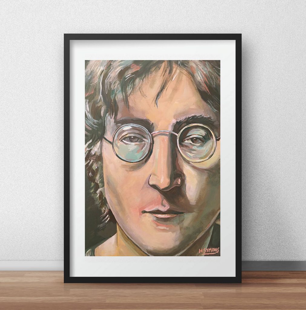
I love using colour within my portfolio illustrations, design and canvas paintings. Colour is a key element of my work, which I’m still endlessly refining.
I have worked hard on developing my colour theory so it gives my composition an added appeal. Not only can it help you, but it can also help your composition too.
Within this blog post you will discover my top artistic tips on how to use colour, that I personally use myself within my illustration and design work. You will learn techniques to discover why colour is so important, how you can use colour to your advantage, and advice to get your head around it.
Why is colour important?
Firstly, colour is the first thing you are approached with when you look at any artwork.
Whilst drawing is focused on form, painting and digital art is what the viewer is offered first. If you have an artwork which uses an extemporaneous colour palette, then you’re already one step ahead.
If you go to any art gallery, you would probably be drawn to the paintings which you like the colour of. David Hockney is one of my favourite painters of all time for his use of colour.
Colour communicates a theme, occasion or atmosphere. It makes a big impression about an artwork, for example, you could use warm colours to represent something completely different to an image using cold colours.
One image communicates a warm and vibrant setting, whilst the other communicates a cold, brisk and different connotation.
James Gurney, author of ‘Colour and Light: A Guide for the Realist Painter‘, says “Professor of chemistry Michel-Eugène Chevreul studied the perception of colours and demonstrated that colours can be understood only in relation to each other and that no colour exists in isolation.”
There’s so much more to colour than at first thought!
Colours all communicate a different message, and helps lead the eye around an image.
If you’re smart and use certain colours around an artwork, the eye can naturally work across an entire piece of art – without you even noticing. It’s a powerful tool, which is why so many artists make full use of it.
For example, if you were to place sky blue colours on an background of warm colours, and arrange it on the left, right and centre, it will help the eye fall on these places – looking at all parts of the image (like the image below).

Hopefully you can see how using colour can help your work!
Look at artists who are colour experts like David Hockney, Henri Matisse to Van Gogh for example and you see how much colour impacts their works. Be inspired and transform your own image creation with effective colour.
So how can you use colour to help your work?
Use a limited colour palette
My first tip is to use a limited colour palette. Colour beginners use every colour under the sun to create a piece of art – which is where it goes wrong.
This loses an image’s appeal, confuses the viewer with clashing colours and doesn’t look nice. What I tend to do, and what seems to work for me, is to limit the amount of colours that I use.
It’s this strict palette that I set myself that can help your colour theory. I would only use three or four colours in an image, like light blue, dark blue, green and maybe an adjacent colour of red. Or another example of using orange, red, yellow and an adjacent colour of green. Can you see what I’m doing here?

I’m only using three or four colours within any painting or illustration. It’s this restriction of that helps my colour. In turn, this leads the viewers eye around my work, as colours are being used throughout an image. If you’re getting stuck with colour, limit the amount you use.
Study the colour wheel
Firstly, in order for you to improve your use of colour within your art, you must understand and know about the colour wheel.
Without this knowledge, you can’t make informed decisions about the correct colour to use within your art.
The colour wheel is your best friend, and you should nurture and learn it like it is your best friend.
Created and developed by Isaac Newton (which has developed by others from Newton to the colour wheels you see today), the colour wheel is a great tool for any artist, designer or illustrator, and the more you know and understand it, the better!

If you completely understand the colour wheel, it can dramatically help your colour choices. You will know what colours work together, what colours clash and make smart choices.
By studying the colour wheel you can begin to choose colours of your choice and select garments which you can use within your work.
I encourage you to learn about hues, to learn about saturation, and learn about ultimately what colours work together.
This is all covered within my blog post about the essential guide to colour wheel basics. From primary, secondary to complementary colours, use this guide as your platform.
Learning what colours to choose from
Secondly, as you start learning about the colour wheel and it importance, you can begin to select colours from the wheel that go excellently together.
Once you build this understanding, your nature intuition will take over. You’ll know that a mixture of saturated and unsaturated colours makes a good artwork for example.
Creating informed decisions
Lastly, instead of selecting colours ‘at random’, you can select colours using carefully informed ‘gamut’. A colour gamut is a cropped section of the colour wheel.
From this gamut, you only use the colours within this section of the colour wheel. For example, you might create a gamut of only red, orange and a touch of blue. This is what the gamut would look like on the colour wheel. This all stems from understanding the colour wheel.
Mix between saturated and desaturates colours
For your colours to work it’s important that you mix between saturated and desaturated colours.
Have you ever looked at a painting which is full of saturated colours, or have you ever used colours within an artwork which is very saturated?
What is your first reaction to a very saturated artwork (like the below image)?

The image is bright, garish, and actually hurts my eyes! I don’t think think the above image looks very nice, unless that’s what you want to communicate to your viewer.
What you need to be aware within your colour creation is mixing between saturated and desaturated colours. Getting the right balance will make your images come to life. For example your artwork could include half saturated colours, which are bright and colourful and the other half desaturated colours. This isn’t the general rule, and should be thought about carefully.

I’ve now changed the image above and used desaturated colours – looks and feels much better!
Moving towards the more grey colours which are easier on the eye helps balance the image. If you get stuck with colour, I recommend to play it safe by using colours which are desaturated, as an image which is desaturated is going to be more pleasing on the eye.
Master artist inspiration
Instead of going it alone, one of the ways I’ve been able to improve my own use of colour is by looking at artistic masters. There’s nothing wrong with being inspired, copying, or even stealing from these masters. You can directly see why they have used colours within their art, which can directly improve your own. I find it invaluable to see the artistic masters colour palettes used within their art.
Furthermore, it’s also good to produce your own master studies. Making a study of an artist’s painting or drawing, studying their own use of colour. I have found this to be the biggest positive impact when learning colour.
However, try to not simply ‘copy’ a piece of art. Force yourself to study, and ask yourself questions throughout, especially ‘why’ questions. Why are they using the colours the way they are for example.
By asking questions it forces you out of simply copying a piece of art to studying it.
Thinking of colours as tones
Much like black and white or graphite pencil sketchbook drawings, colours also have tonal values.
Firstly, start thinking about colours as tones rather than colours, and it will help your artworks immensely. Your images will be more atmospheric, have more depth and suggest a 3D-like image.
For example a dark blue is darker than a light yellow. This might sound obvious but this is sometimes overlooked when we work with colour.
I recommend inverting a coloured image to black-and-white to see how it sits up tonally. This is only effective for those of you working within Adobe Photoshop (or similar), as I word turn a coloured image to black-and-white several times in my editing process to see the colours as tones. I can then see which colours I need to darken, and which colours I need to lighten.
This isn’t a permanent change, as I’ll either create a new document and copy the black and white layer into it, or just undo my edit.
If you’re not working digitally and working traditionally, squint your eyes whilst looking at an image.
How does this help?
It allows you to see your colours as tones, as your eyes desaturate what’s in front of you.
Have a go now by squinting your eyes and see how you can make out tones within a multi-coloured environment. Can you notice the light and dark colours?
Bonus tip – clean your palette
One last bonus tip I want to share which is relevant to those of you who work traditionally using paints and a pallet, is that you should clean your pallet regularly.
Not cleaning your painting pallet results in muddy colours, and you’ll start mixing different colours into your painting.
I recommend a painting pallet which is ceramic and not made out of plastic, as plastic is hard to clean and mix with.
Lastly, it’s also imperative that you clean and empty your water regularly, as your water can become muddy when using several different colours.
How to use colour – conclusion
I hope you’ve enjoyed this blog post to help you improve your use of colour.
It’s always a working in progress for me as I feel that colour theory and learning about it never stops.
I would love to know what you think about this blog post, so please comment below and share your colour advice or how you manage colour.
Say hello or give me a follow on social media on the links below, I would love to hear what you think about your own colour theory, how colour has improved your work and a place to add further discussion.
Discover my illustration portfolio for more of my work or check out how complimentary colours can help your colour theory.
Cheers guys, and see you on the next blog post!
Many thanks for listening and visiting my news page today. You can follow what I’m up to on my Twitter, Facebook or Instagram pages, I’ll really appreciate it if you do, and don’t be afraid to say hi to me! Many thanks again, and have a great day!
 16th December 2018