One fine way to improve your art is by using complimentary colours.
Past and present artists have used this colour technique, from Van Gogh, Henry Matisse to Monet. It’s a proven method that results in strong colour choices.
If you would rather watch instead of read, check out this video:
The colour wheel
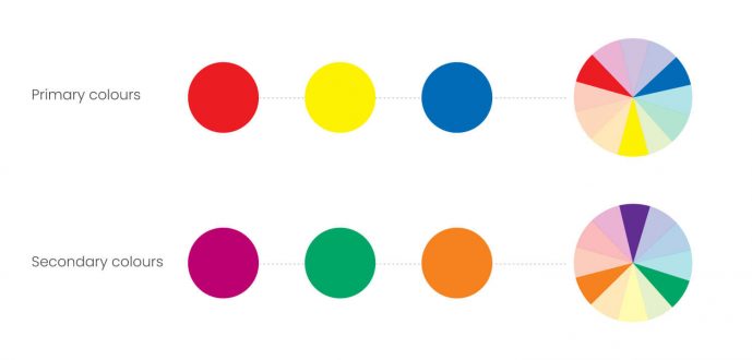
The colour wheel was first proposed by Sir Issac Newton, back in 1666. He was the first to suggest colour wrapping around a circle. Artists use the colour wheel to determine colour relationships. The wheel is made out of 6 principal colours.
The colour wheel houses primary colours (red, yellow and blue), and secondary colours (violet, green & orange). Mixing primary colours forms secondary colours. This is a traditional colour wheel, that most artists use.
Complimentary colours sit opposite each other in the colour wheel. A complimentary colour’s opposite is one of the secondary colours. This is a mix of the other two primary colours, for example:
- Violet is the compliment of yellow (mixing blue and red together)
- Green is the compliment of red (mixing blue and yellow together)
- Orange is the compliment of blue (mixing yellow and red together)
There is always a compliment for every colour, regardless of a colour’s hue, shade, or tone.
What happens when you mix complimentary colours together?
Mixing 2 complimentary colours together forms a neutral grey.
The term ‘neutral grey’ is a term given to colour which has no hue specification. A hue is where a colour sits around the colour wheel. You can intensify saturated colours by placing neutral greys next to saturated colours. Using greys ensures colour balance within your art. This is all based on good colour theory. Colour is essential within any artwork.
Famous artists’ colour palettes have used this knowledge to create harmony, impact, and appeal in their work.
The brightness of complimentary colours pairings
Pairing complimentary colours together can make them appear brighter, more saturated, with a higher contrast. This is due to simultaneous contrast. This is when two colours affect each other when placed next one another. The hue, saturation or brightness can change when two colours sit side by side.
For example, when using red and blue proximity, the red appears more orange, and it makes the blue, more green in hue. This is due to our perception of colours. As we never see colour in isolation, this happens more than you think.
In Conclusion
I hope this article has helped you understand this powerful colour method. It’s certainly helped me how to use colour.
We can learn a lot from famous artists, and if it’s good enough for them, it’s good enough for me! In summary, here’s what we covered today:
- Complimentary colours are those that sit opposite each other in the colour wheel
- The colour wheel is made out of six colours, three primary and three secondary
- The three primary colours are red, yellow and blue
- The three secondary colours are orange, violet and green
- Mixing complimentary colours together forms a neutral grey
- Pairing complimentary colours proximity changes the hue, saturated and brightness
If you’re looking to learn more, see how limited colour palettes can help you improve your use of colour. Alternatively, check out my book review of ‘Colour & Light‘.
If you’re more of a visual learner, then do check out this video on complimentary colours. I share my tips and knowledge all about complimentary colours in this quick video. I’ll also love to hear from you, so please do add me a comment below.
Many thanks, and have a great day!

 2nd October 2022