Wondering what are analogous colours?
Want to improve your colour theory?
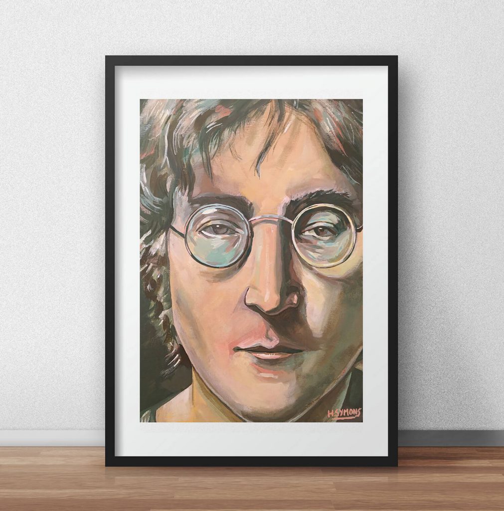
For artists and designers, improving your use of colour is essential. Colour plays a crucial role in making a good first impression, which what makes learning colour so important. I’ve studied a lot of colour theory, that has helped my work, like my illustrated portraits for example. Yet, if you’re struggling with colour, a great way to begin is by focusing on colour schemes. This in turn can help your colour and your colour theory.
Within this guide you’ll learn what analogous colours are, how you can use this colour scheme, and how it can improve your colour theory. We will look at different artists who have used this colour scheme, with lots of tips and tricks along the way.
If you’ll like to find out more about colour, uncover this guide on complimentary colours. Or get started with the world of colour theory with this essential colour guide. So with that covered, lets discuss what analogous colours are.
What are analogous colours?
Analogous colours are colours that sit next to each other in the colour wheel. The colour wheel compromises of primary and secondary colours. Analogous colours only house colours that neighbour each other in the colour wheel. It’s classed as a limited colour palette, or gamut.
The colour wheel splits between warm and cold colours. Red, orange and yellow for warm colours, and blue, violet and green for cold colours. An analogous colour scheme usually sits in one of these areas, as shown in the image below.
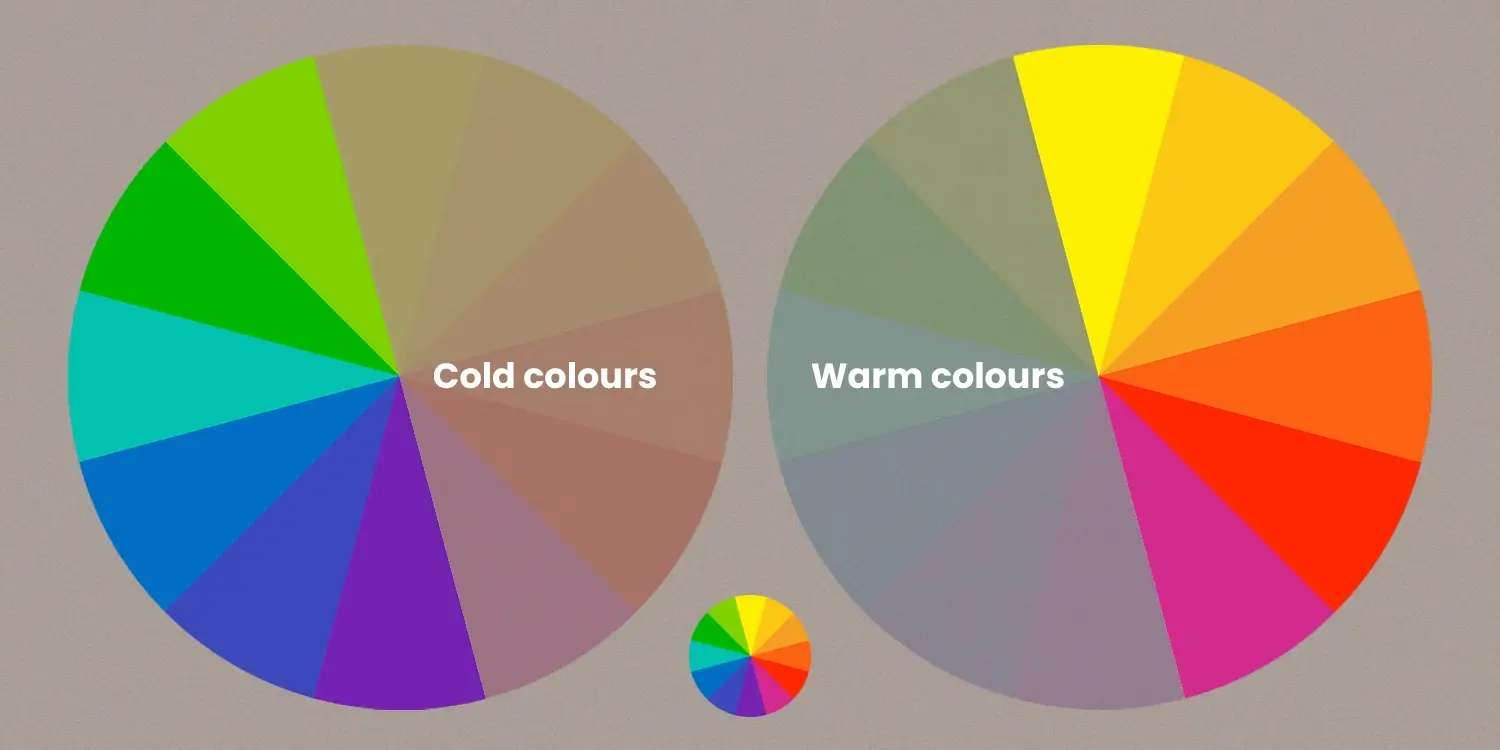
For example, a cold analogous colour scheme could be blue, light blue, dark blue and light green / blue. Or, you could select a warmer version. Compromising of orange, yellow and red. Like my portrait illustration of the late Wally Olins for example. Sometimes a warm or cold colour crop up in this colour scheme. But this acts as an adjacent. For example, warm colours take ownership in green, yellow and orange. Or red, purple and blue. With the authority in this example going to cold colours. Most of the time, to make it simple, analogous colours sits within the warm or cold spectrum.
Why should you use analogous colours?
Analogous colours are pleasing on the eye and are harmonise with one another. This is because these selected colours are from the same colour family. For example, colours like orange, red and pink belong to the warm colour scheme. So these go well together, as they are also seen in nature (fire, petals, the sun).

Use analogous colour schemes to reduce the decision process when starting an artwork. Even though I’m quite clued up with colour theory, it can still be challenging to think of which colours to use. Using an analogous colour scheme clears this headache.
A limited colour palette, like I’ve discussed many times, improves your colour choices. Instead of using every colour under the sun, it makes you focus. Narrowing your colours is a great thing in art. If you haven’t tried it, I recommend it.
How many colours should you use?
There’s no hard and fast rule with the amount of colours you should use. However, I recommend no more than four. This is because by selecting four or more, it diminishes the potency of analogous colours. Say you used five colours of red, orange, yellow, green and blue. By selecting these, it’s not an analogous colour scheme anymore. As we now have a mixture of both warm and cold colours together. For this reason, I recommend three or four is the ultimate sweet spot.
What artists have used analogous colours?
One great way to learn about art, is by studying the great masters who have come before us. By studying their work, we can become better artists and designers. Like in my article all about how the great masters created their compositions.
Vincent Van Gogh – Sunflowers (1888 – 1889)
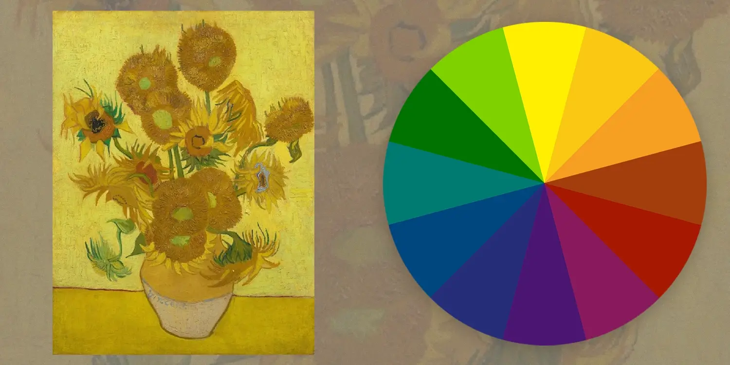
One key artist to have used analogous colours is Mr Van Gogh himself. In particular, his ever-famous sunflower painting. Made between 1888 – 1889 in Arles, oil on canvas, 95 cm x 73 cm. Can you spot the colour scheme that he’s used? That’s correct, he’s chosen a warm colour palette. Compromising of yellow, yellow / brown and green. It’s one of his most famous works of art, and for good reason. As you learn more about colour schemes, you’ll see the secrets behind their work time and time again. This example is no different.
Claude Monet – Waterloo Bridge, Overcast Weather Two (1899 – 1901)
There’s no better example of an artist who uses stronger colour choices than Claude Monet. Painted in oils on canvas, in an impressionist style of Waterloo Bridge in London. Monet focuses his colours on purple, red and blue, and to great effect! The ambiance is striking, and you can feel the smog from the city. It’s an epic piece of canvas art.

Rembrandt – The Return of the Prodigal Son (1661–1669)
Using oils on canvas to create this masterpiece, Rembrandt focuses on warm colours. A masterpiece for colour but also composition, Rembrandt uses yellow, red and orange. Rembrandt loved strong contrasts within his paintings, and chose warm colours often. It’s hard to choose a favourite out of these three artists, I’ll leave that decision up to you!

Tools I use to create colour schemes
To help me create analogous colours is Adobe Colour. This tool lets you create colour schemes, select popular gamuts, and more. It’s useful when I’m creating digital illustrations, or if I’m stuck with my colour. It’s my go-to art and illustration tool.
Conclusion – lets wrap up what we have learnt
I hope you’ve learnt a ton within this blog post! I’ve learnt a few or two, so I hope you have too! If you’re eager to learn more, check out my new video on complimentary colours on my YouTube channel. To summarise what we have learnt in today’s article:
- Analogous colours uses a limited colour palette, ideal for strong colour selection.
- Use three or four (three is ideal) selected colours within the colour wheel.
- To make an analogous colour scheme, colours have to neighbour each other. For example, red, orange and yellow.
- Analogous colours include either cold or warm colours. However, depending on where you position your colour scheme, it could have a mixture of both. Like red, purple and blue for instance.
- If this occurs, one colour acts an adjacent to it’s compromising warm or cold colour. Going back to the red, purple and blue example, red acts as the adjacent.
- Avoid choosing more than four colours, as you’ll dilute it’s effectiveness.
- Lots of famous artists used analogous colours, from Van Gogh, Monet to Rembrandt.
- Adobe Colour has everything you need to create different colour schemes.
As we’re on the topic of colour, do check out my other article on the colour palettes used by famous artists. I go into detail of how you can learn more about the colours they use. Or discover how you can level up your colour with this blog post.
Many thanks for listening and visiting my news page today. Follow what I’m up to on my Twitter, Facebook, or Instagram pages. Many thanks again, and have a great day!
 20th December 2022
