Radically improve your designs by learning the baseline grid.
It can help propel your typography, compositions to overall design skill.
Learning the baseline grid has been the best thing I’ve done that’s enhanced my design work, and I’m here to show you how.
What you will learn from this blog post?
Within this blog post you will learn:
- What the baseline grid is and why it’s important.
- How you can apply the baseline grid to your designs.
- A tutorial (with screenshots) which you can follow.
- And how you can use it in Adobe InDesign and Adobe XD.
So let’s get into it.
What is the baseline grid?
The ‘baseline’ is a term used in typography, where text sits or rests on an imaginary line, called it’s baseline.
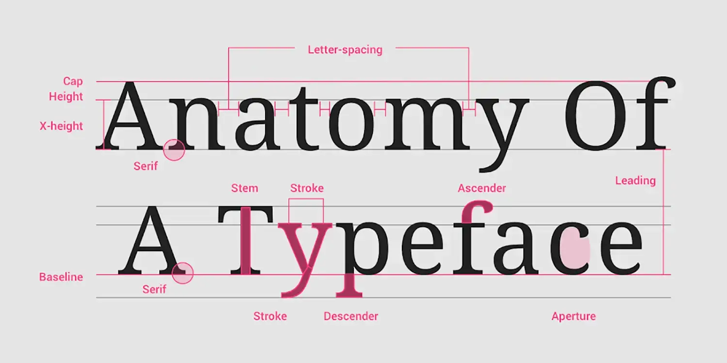
Here, the baseline and the grid combine, to create the ‘baseline grid’. This is where text sits on horizontal lines of a document; it’s baseline.
Think of the baseline similar to that when writing in a notepad with ruled paper, this is essentially what the baseline grid is.
Newspapers, books and publications, with a large amount of text benefit the most from using the baseline grid. This ensures every text block is consistent with one another.
The designer can adjust the baseline, which is essentially the typography’s line height, with a digital publishing software, most commonly Adobe InDesign or equivalent.
Why use the baseline grid?
Designers use the baseline grid to create a vertical rhythm throughout their design work.
Every piece of text conforms to the same line spacing. It ensures readers receive the same reading experience throughout, as blocks of text are in-line with one another.

The baseline grid ensures your typography is horizontally consistent. As an example, when you’re next reading a book, magazine or newspaper, notice how the blocks of text lines up with one another.
It removes the guess work out of design, brings confidence to the designer and it looks better too. I highly recommend you start employing this into your design work. It can help transform you from an amateur into a professional. I guarantee all professional graphic designers use the baseline grid – and for good reason.
When applied, you trust all of your your text lines up with each other. Using the baseline grid is good practice.
When to use the baseline grid
Pages with a large amount of text should be formatted using the baseline grid. It’s most ideal when designing magazines, books to publications.
The baseline grid is also suitable for one page designs, like digital landing pages, posters to website design. Using a consistent line height is ideal when sending your designs to be built by website developers.
I recommend using it for all design work, from posters to brochure design. Numerous designers hold the misconception that the baseline grid is exclusively suitable for double-page documents, such as brochures, leaflets, or publications. However this is incorrect.
Yes, it’s ideal for multiple page designs, but single document designs can hugely benefit from applying the grid. To create a sense of rhythm, order and consistency, the baseline grid for single page documents is also recommended for good design (not just leaving your text to guess work).

How to show and hide the baseline grid visible in Adobe InDesign
To show the baseline grid in Adobe InDesign, select View > Grids & Guides > Show baseline grid. The shortcut for showing the baseline grid on Mac is Option + Command + ‘. For Windows, it’s Ctrl + Alt + ‘.
For most settings in Adobe InDesign, you will need to zoom in to see the blue lines on the page(s). This is usually set at 75% zoom, called the View Threshold setting. This can be changed by going to InDesign at the top left corner, Preferences > Grids > View Threshold setting.
To hide the baseline grid in Adobe InDesign, deselect the tick by going to View > Grids & Guides > Hide baseline grid. The shortcut for disabling the baseline grid on Mac is Option + Command + ‘. For Windows, it’s Ctrl + Alt + ‘.


Aligning your text to the baseline within Adobe InDesign
To align your text to the the baseline grid in Adobe InDesign, select your text, go to the ‘Paragraph’ tab, and with the tab open, select the bottom right icon to ‘Align to the baseline grid’ (it looks like two separate blocks of text next to each other).


That piece of text will now snap to the baseline grid.
To disable any piece of text to the baseline grid in Adobe InDesign, go the the ‘Paragraph’ tab, and with the tab open, click the icon at the bottom right to ‘not align to the baseline grid’ (where the lines are not in line with each other).

How to move text blocks with the baseline grid in Adobe InDesign
With the baseline grid turned on, text automatically ‘snaps’ to the baseline grid within your document.
If you move a text box up or down with the arrow keys, the text box will move, however your text will only move (or snap) to the baseline when it hits the next baseline below or above.
Those new to the baseline grid can become frustrated by this – as you can’t just move a text box randomly. Remember though, the baseline grid keeps a vertical rhythm and will make typography much stronger when it’s applied. So keep at it!
How to use grids with a baseline grid in Adobe InDesign
To take the baseline grid to a whole new level, you can apply guides that conform to your baseline grid. Guides achieves consistency, order, and can be setup and changed by you.
You can apply guides and the baseline grid to design work effortlessly – a match made in heaven.
(If you’re new to typography, then I highly recommend ‘Thinking With Type‘, which is free online. A paperback book is also available, and is a firm favourite on my book shelf.)
All you need to do is keep practising and make it work for you.
This is where it gets really fun, and most importantly, ultra-satisfying!
If you apply horizontal guides to your document, it may not be inline with your baseline grid.
Look at the example below.

You can see that the baseline of the typography’s doesn’t sit on the grid. This is annoying as the grid doesn’t work hand-in-hand with your typography.
However, this is easily solved by changing the margin to absorb the baseline.
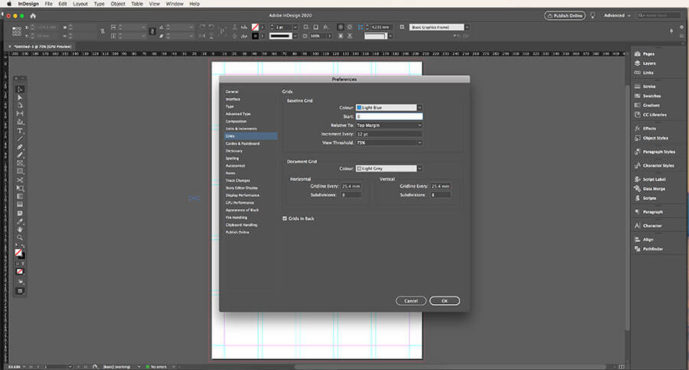
Step 1: Switch on your baseline grid visibility by going to View > Grids & Guides > Show Baseline Grid. Set the baseline grid to start from your top page margin (which you can change by going to Preferences > Grids > Start: 0 > Relative To: Top Margin).
I also prefer to change the ‘View Threshold’ setting to 25%. This allows me to see the baseline grid from 25% (and not having to zoom up close).

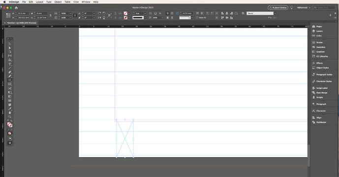
Step 2: Using the ‘Rectangle Frame Tool’, click and drag a box to create a text box, and from the bottom of your document, increase it’s size to the nearest baseline in relation to the margin. Copy the height of this text box.

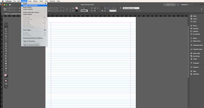
Step 3: Go to Layout > Margins and Columns, and paste the height into the ‘Bottom field’ – this ensures your margin absorbs the baseline, and should be flush with the baseline. Make sure you turn OFF the link anchor, which is in the middle icon in the number fields – as you only want the bottom margin to be different from the top and sides.


Step 4: Using the rectangle frame tool again, measure the height of the baseline’s increment.
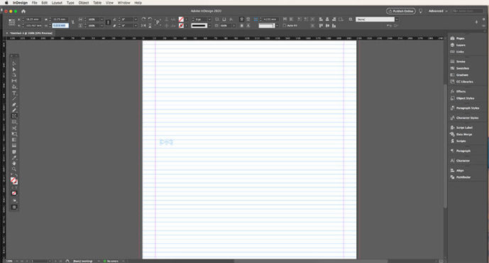
Step 5: Go to Layout > Creates Guides, and paste the height of the baseline into the ‘Gutter’. This ensures the height of your gutters are the same as your baseline grid. Also make sure that you have ‘Preview’ ticked (below the ‘Cancel’ button), and in the ‘Options’ field, ‘Fit Guides to’ are set to ‘Margins’ (this is crucial or this process will not work!).
Pro tip: I also set the column gutter to the same as my row gutter – keeping it consistent!

Step 6: Next, input the number of rows that fit into your baseline grid. This can be a bit fiddly, but you want your grid to fit perfectly with your baseline underneath. This may mean increasing or decreasing the number of rows until you get this spot on.
Step 7: If you find no number fits into your grid, you may need to move your margin up or down one baseline increment, and go back to step 4 of this mini tutorial. Sometimes it takes some experimentation to align your grids to the baseline grid – just keep with it!

And there you go!
You can now create a text box which aligns to your baseline, and it fits into your grid!

I also highly recommend you lock your guides too, so you can’t accidentally change a guide later on. You can lock guides on Adobe InDesign by selecting View > Grids & Guides > Lock Guides. Or the shortcut on Mac is Option + Command + ;. On Windows, it’s Alt + Ctrl + ;.
How to change the baseline grid increment In Adobe InDesign
To adjust the baseline increment of an Adobe InDesign document, click InDesign (top left corner) > Preferences > Grids > Increment Every.
Here you can change the spacing in pts. With this setting you can change the line height of your text.
You can adjust the line height of your baseline grid, which applies to your entire document. For example, if your baseline grid is set to a increment of 10pt, your whole document conform to this increment.

If you change the baseline grid spacing of a document by changing the ‘Increment every’ field, and you have text in your document which is already aligning to the baseline, it will automatically change the line height of that piece of text.
This can result in text errors on your pages, so beware! It can also lead to your line height being either too generous or excessively tight, depending on your text size.
It’s really important therefore to experiment with what works and what doesn’t.
As you can see from my example below, I’m working with 11pt text, with a baseline of 28pt. The leading of the typography for this type size is too large, and it needs adjusting.
To do this, you need to go back to the ‘Increment Every’ setting. From eye, I can see that a baseline of 16pt with 11pt text works a lot better. Or, instead of choosing a baseline of 16pt, I could choose 8pt. This is essentially the same as choosing 16pt (as 8 goes into 16 twice), but gives me flexibility if I want to work with smaller text.


This is what you need to be aware of when using guides and baseline grids.
Not every type size is going to look good with the baseline grid turned on, so you need to adapt your grids and typography to make it work. You are in control of your grid and guides. You aren’t the slave to it.
As another example, you may choose 11pt text and 15pt baseline for main text, but you may realise your headings of 20pt with 15pt baseline makes the leading too tight.
It’s up to you to either decrease the heading size to suit (18pt with 15pt might look better), or increasing the baseline to 18pt for example.
I recommend selecting smaller baseline increments for greater flexibility, allowing for smoother transitions into larger values. For example, a 5pt baseline easily scales to 10, 15, and 20, while a 6pt baseline accommodates 6, 12, and 18. Similarly, a 7pt baseline smoothly transitions into 14, 21, and 28, creating a harmonious rhythm in your design.
Pro tip: Explore with ‘dummy’ piece of text first, playing around with the line height and text size, before committing to your baseline grid increment.
Baseline Grid With Adobe XD
Unlike Adobe InDesign, you can set your typography to a baseline grid, Adobe XD is a bit more fluid and manual than its counterpart.
Using the baseline grid on your website and digital designs will make them stronger, more consistent, and bring a sense of rhythm to your work.
With an Adobe XD artboard open (dimensions of your choice), click the file name at the top of the artboard. This brings up the grid options on the right-hand column. Choose ‘Square’ option (Command + Control + ‘ on Mac, and Alt + Ctrl + ‘ on Windows), and leave the default of 8. With this applied, squares show on the document.


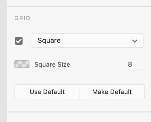

When choosing your typography line height and size, be sure to make it divisible by your square size. From my square option settings of 8 applied, I could choose a body text size of 16, and a line height of 32.
With this size, position your text so it rests on the horizontal. Your typography is now resting on the baseline grid, exactly what we want! From here, you can create a h1, h2, h3 .etc, with these principles in mind (following the division of 8).
In the example above, I’ve gone for a h2 size of 40 and line height of 56, and a h1 size of 80 and line height 96. If you change the square grid, make sure your typography size and line height is divisible by this number.
For example, if you choose a grid layout of 10, you could make your body text 20, with a line height of 30.
Zoom into your document and make sure everything sits on the baseline grid – especially the gaps between the paragraphs. And there you go, a baseline grid set up in Adobe XD!
Pro tip: Use the grid option of ‘Layout’, which is very useful!
In conclusion
Here’s what we’ve covered in today’s article:
- The baseline grid ensures vertical rhythm to your designs and typography.
- With the baseline grid applied, your text conforms to the same line height.
- You can toggle the baseline grid off and on in Adobe InDesign.
- Experiment and practice using the baseline grid with your designs.
- Use guides and grids together to bring even more consistency to your work.
- Not only can you use the baseline grid in Adobe InDesign, but that of Adobe XD too.
The baseline grid has been revolutionary for me. When I was a beginner to this process, I hated it!
It was a pain, it was frustrating, but I could see how important it was. So I persevered and use it every time I use Adobe InDesign. It’s helped me so much in improving my own skill.
If you’re new to the baseline grid, it can be challenging, but it’s crucial that you stick with it.
If you liked this blog post
I’ll love to hear how you get on with using the grid, and how it’s helped your design work! If you’re new to my blog and illustration work, do check out my previous blog post about ‘The Golden Ratio & How It Can Help Your Art, or have a peek at my illustration portfolio!
Let me know what you think of this blog post by commenting below!
Many thanks for listening and visiting my news page today. You can follow what I’m up to on my Twitter and Facebook, I’ll really appreciate it if you do, and don’t be afraid to say hi to me! Many thanks again, and have a great day!

 21st December 2019


