Want to learn how to use grids within your designs, to take them to the next level?
Curious to learn about grids in design?
If you know me, you know how much I love grids (and also the baseline grid).
I’ve been using it my design work for years, and just simply love anything with a grid. From magazines, brochures, to posters, grids are everywhere in the design world. With the fact that grids allow you to make sure everything is inline with other graphic elements, grids help keep a natural and engaging flow (especially with multiple pages). It’s really improved my own design work, and I’m excited to share what I’ve learnt with you today.
In a nutshell, using grids will help you become a better designer.
Within this blog post you will discover how to use grids within your design work. I’ll be sharing my knowledge of how to create grids in Adobe InDesign, with other brief mentions of how to set up a grid in other Adobe programs. You will learn why grids are important, what makes up a good grid, and much more.
So, sit back, and learn how to use grids within your design work. But first off, what even is a grid?
What Is A Grid?
A grid is a mostly termed as a series of rows, columns and gutters in an art board.
Whenever I think of a grid, I think of classic design posters and newspaper prints (which use column grids excellently). Setup by the designer, grids are invisible and aren’t shown in print / digital (unless the designer wants it). Designers use grids to make their designs consistent and make engaging designs. In print, grids are commonly used in devices such as magazines, newspapers to books. Digitally, grids lends itself well to website design and app design in particular.
Think of a grid like a skeleton or structure to a design. Skeletons and structures are the backbone of a design, but it’s the skin on top which people recognise. These ‘structures’ offers flexibility and reasoning to a design.
Grids can be found in most Adobe programmes, such as InDesign and Adobe Illustrator (and other design programmes like Affinity). If you’re familiar with guides on Photoshop, grids are like guides on steroids. Not all guides are consistent, but most grids are, especially when used through multiple artboards and pages.
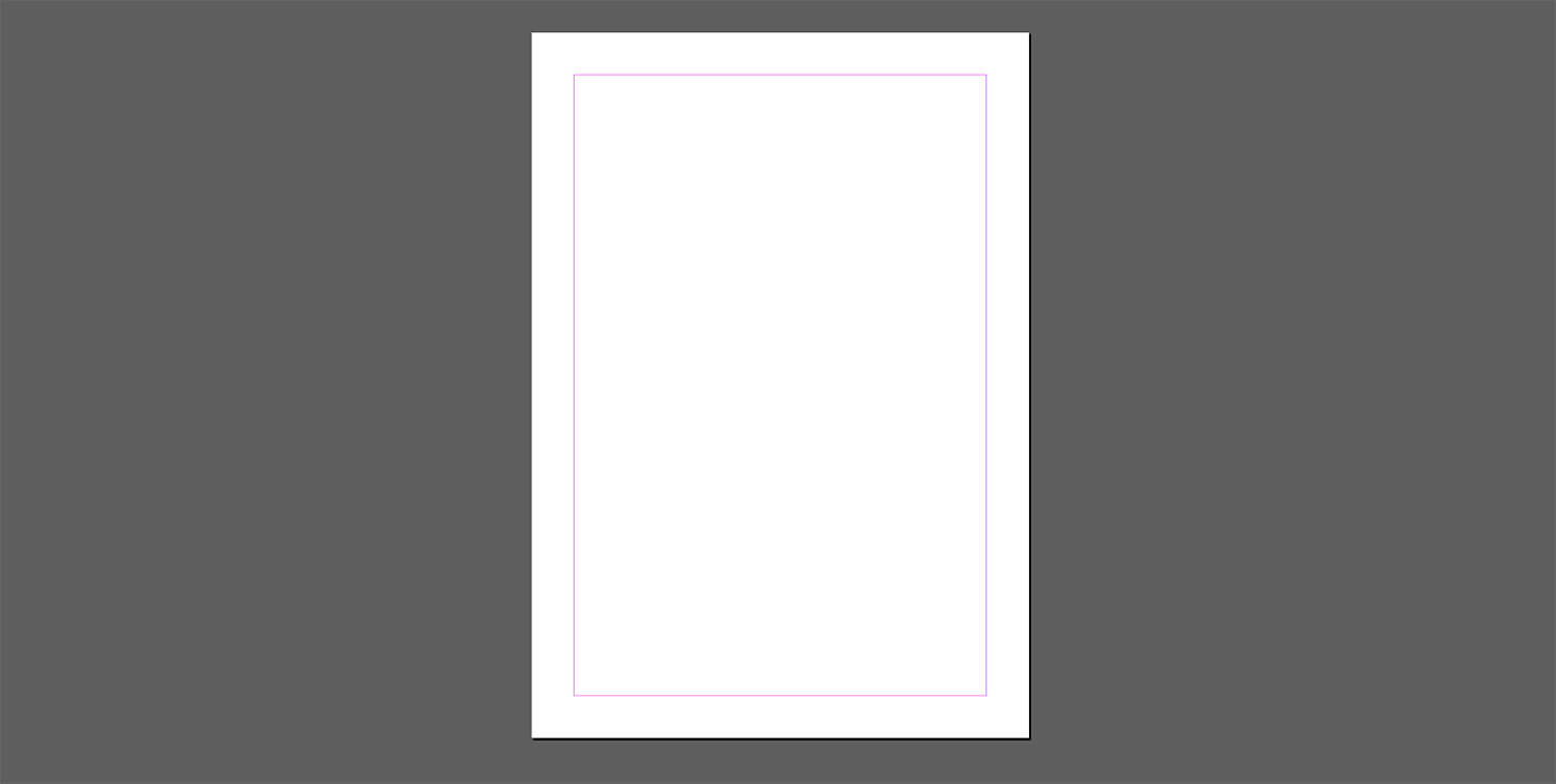
There’s single grid designs (like the example below), which is ideal for simple documents. Multicolumn and multi-row grids allow for more complex design solutions – like books and publications for example.
Why You Should Use Grids
You should use grids within your design work because it strengthens consistency, gives you flexibility, and gives you structure to work towards. There’s nothing worse than starting a design from a blank piece of paper. Where do you place the first piece of content? Where do you place the typography? Where do you even start?
Using grids eliminates all of these problems.
Setting up a grid gives you a structure to work towards. Think of grids as a building’s foundations when building a house. With the foundations in place, the house builders can start building the house piece by piece. After it’s built, the foundations are invisible – but is crucial to the buildings stature. This is the same with grids. You need grids to form a consistent and structured design, but is invisible on the surface.
Grids are especially important over multiple pages or artboards. When you look at magazines to newspapers – grids are commonly used to ensure consistency throughout. Not only do grids add consistency, it gives you flexibility. Most people think grids restrict freedom, but quite the contrary. More restrictions allows you to be more playful and experimental – starting from a blank artboard offers too much freedom.
Not only are grids used in print, it’s also commonly used in digital and web design. I’m highly confident most famous designers uses some form of grid. I love using grids and highly recommend it to all designers – beginners to experts.
History Of The Grid
‘Villard De Honne’ first used the ‘design grid’ in the 13th century by ‘. He used ‘margins of fixed ratios’ within his printed publications (which is still a popular way of constructing a grid to this day).
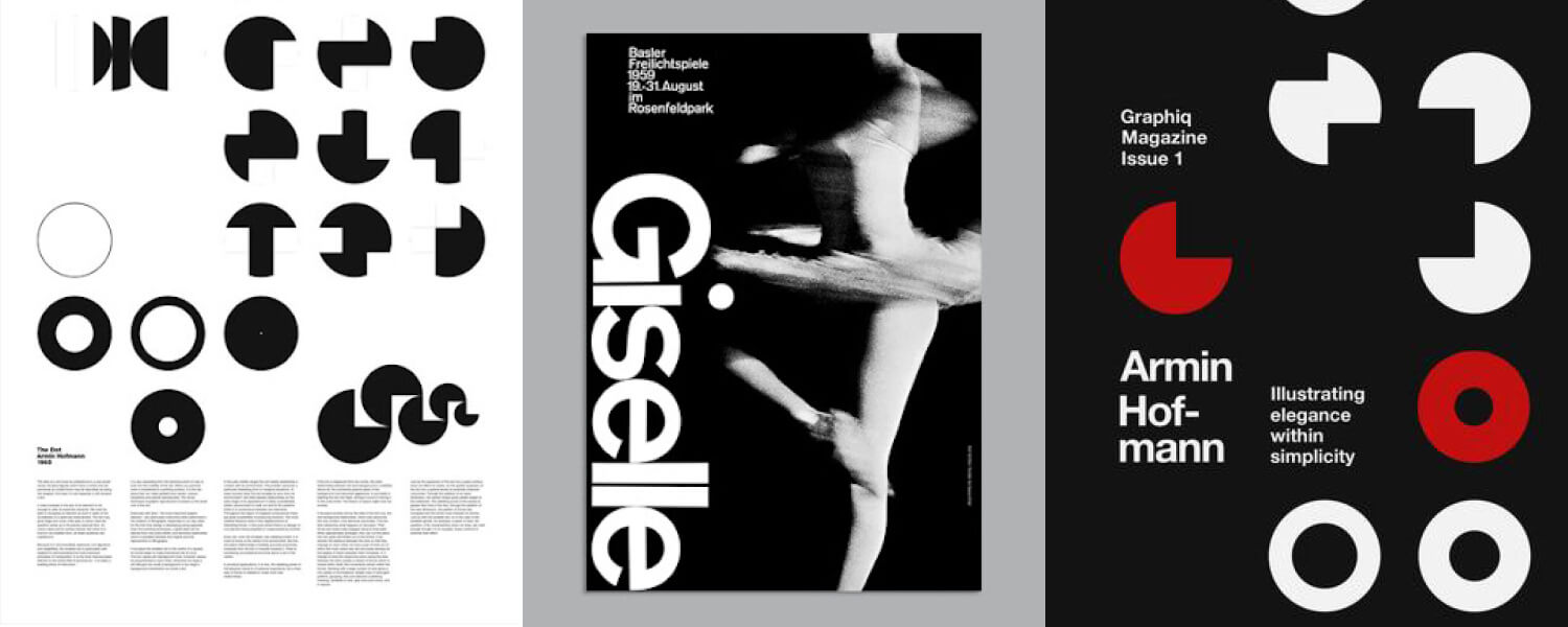
Things got interesting later in the 20th century. Movements like Bauhaus and De Stijl experimented with the use of grids in design. Creating epic posters in particular, all with the aid of the grid. One of my favourites Armin Hofmann, used grids within his poster designs perfectly.
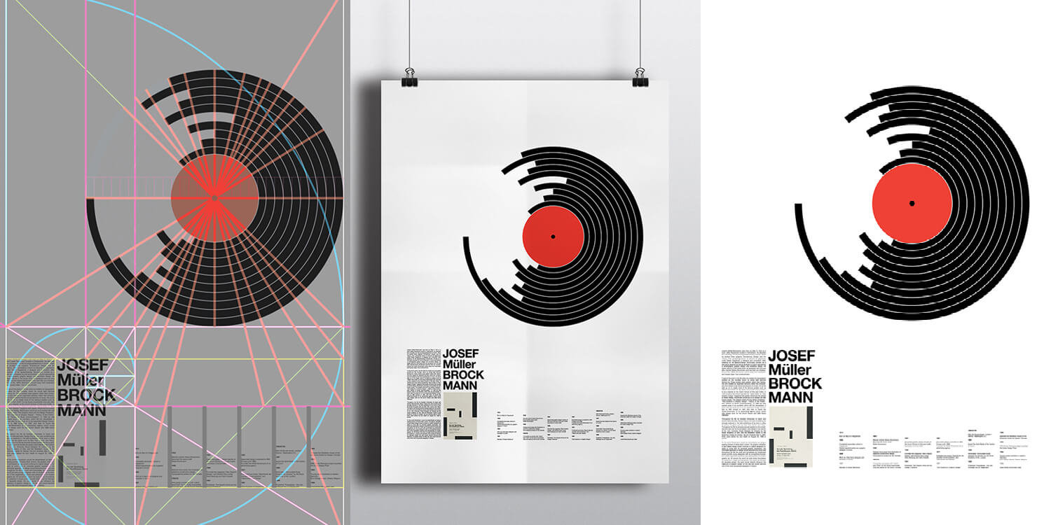
Josef Müller-Brockmann popularised grids in the 1960’s, especially his book ‘Grid Systems’. According to DesignLab, Müller-Brockmann:
“Pushed the limits of grids by creating modular and rotated grid systems. He published a detailed handbook (essential reading for any graphic designer) called Grid Systems in Graphic Design, and it represents a collation of the insights gained through his illustrious career”.
From this point, grids have gone from strength to strength. Rule of thirds, golden ratio, grids for publications and newspapers, to excellent books like ‘Thinking with Type‘, which discusses the importance of grids in design.
Sometimes we don’t even realise we are viewing an ‘invisible’ grid, look at BBC News for example – a prime example of grids in website design.
What Is A Gutter In Grids?
Gutters are the space between rows and columns, and is set by you, the designer. Designers avoid placing any items within the gutter. This isn’t a strict formula, as text and images can go over the gutter. Remember, to create good designs using grids, you need to be in control over the grid (and not the other way round).
Designers use gutters to help them arrange things consistently around an artboard (or over multiple pages / artboards).
For example, you may choose 3 rows and columns with 5mm gutter over one artboard, like my example below. Can you notice the many different arrangements with this grid that I can come up with? It’s fluid and flexible depending on what I want out of the design.

Generally speaking, most of my elements above aren’t arranged on the gutter. I can decrease and increase the gutter if I wish, which changes the row height and column width. When choosing a gutter, think about what you’re designing, and how much space you want to play with.
It’s a good idea to play around with rows, columns and gutters.
How Big Should Your Gutters Be?
When arranging your grid structure and gutters in particular, how big should your gutters be?
Unfortunately, there isn’t a one size fits all approach. It depends on your desired goal, your artboard dimension, and how close you want your items to be (typography and images). This is down to your choosing and what you think looks best – experimentation is certainly recommended here.
However, if you want your gutters to sit on your typographic baseline (and you should), your gutters should be the width and height of the baseline.
For example, if your baseline increment is 10pt, then your gutters should either be 10pt, 20pt, 30pt .etc. If your increment is 8pt, your gutters should be 8pt, 16pt, 24pt .etc – you can see where I’m going with this. For more information and a step-by-step process on how to arrange your Adobe InDesign grid with your typographic baseline, I’ve shared my article tutorial below.
Applying A Grid To Your Baseline Grid
If you want to apply a grid to your baseline in Adobe InDesign, then I highly recommend you check out my previous blog post. I share the step by step process to setting up your grid so it perfectly aligns with your typographic baseline.
If you don’t align it to the baseline, your typography will sit haphazardly all over the grid, not conforming to the grid you setup. Check out my previous ‘Beginners Guide to the Baseline Grid’ for more on this.
Experiment With Your Margins
When I was a beginner to the world of design and using grids, I would often conform to the set margins. For example, I would use the automatic & set Adobe InDesign 12.7 mm margins if I was creating an A4 design. There’s 3 problems with this:
1 – All of my designs would start to look similar.
2 – There’s no creativity.
3 – My grids would start to stagnate.
When I began to get comfortable with using grids, I noticed how powerful it can be to experiment with grids, and in particular margins. Don’t just conform to the software’s margins, and play around with the margins you want. You can create a right orientated margin, a tighter, shorter width margin, or a margin based on the golden ratio.
Here’s some examples below, set on A4 dimension. It’s important to think about the type of design you’re creating, and using a margin which works in unison.


How To Setup A Grid In Adobe InDesign
With a new document open (doesn’t matter what dimensions your file is), go to ‘Layout’ > ‘Create Guides’. Within this panel you can choose the number of rows, columns and gutter size. Be sure to tick the ‘Preview’ box.

Do also note the ‘Options’ settings as well, as this is important. You can choose to fit your guides to your margins, or your page. For example, look at my example below.
The below images show a series of 3 rows and columns which are fitted to my default margin, with the other fitting to the page. Can you notice the difference? The rows can fit to either your margins, or your page – so it’s important that you consider this.


I usually choose fit to margins, but depends what I’m working on. (If you’re working with the baseline grid, do check out my previous blog post to help you setup your Adobe InDesign guides with the baseline grid).
Once you’re happy with your choice, click ‘OK’, and your guides are created! To toggle your guides on or off, press the ‘W’ key. In most cases, guides are not printed or shown within the final artwork.
If you want to change your guides or remove them completely, you can do this by going to ‘Layout’ > ‘Create Guides’ > ‘Remove Existing Ruler Guides’. This removes all guides from the document, for you to create new guides.
I always make sure I lock my guides in place, so I don’t accidentally delete them! To do this, go to View > Grids & Guides > Lock Guides.

Pro Tip: Applying Grids Across Multiple Pages In Adobe InDesign
The best way to apply grids across multiple pages in Adobe InDesign is to follow the steps above, however applying them on your ‘Master’ page. If you’re unfamiliar with Master pages in Adobe InDesign, think of them as your template. Whatever you put on your Master page, this will appear across the pages throughout your document.

To do this, open a new document (or load an existing one), and go to your ‘Pages’ panel (if you can’t see your ‘Pages’ panel, go to ‘Window’ > ‘Pages’). You can see the number of pages in this panel, and this panel also shows ‘A-Master’. Double click on the pages icon opposite. This takes you to the Master page(s). As soon as you start editing, adding, and deleting things from this ‘Master’ page, it will affect your whole document.
Creating grids on your Master pages is a spicy recommendation. When applying grids to your Master pages, your guides / grids will show throughout your document. I highly recommend you do this as it guarantees consistency throughout and ensures good design work.
How To Setup A Grid In Adobe XD
Grids are an essential tool in any print and digital project. Websites, apps, and digital pages use grids, so it’s important you learn how to enable grids in a digital design software like Adobe XD. To setup a grid in Adobe XD is just as easy as using grids in Adobe InDesign.
Simply create a new artboard of any size or dimension, and hold CMD, shift and ‘ on Mac to enable the grid. This same combination of keys disables the grid. To change your grid, click on the artboard name, and go to ‘Grid’ in the lower right corner of the window.

You can change the number of columns, colour, transparency, and width. It’s a powerful tool as you can copy these grids into other artboards throughout a project, by clicking ‘Make Default’. ‘Use Default’ uses the default grid setup that has been placed within the project. You can also work with a square grid by holding CMD and ‘.
Adobe XD doesn’t allow you to use rows like Adobe InDesign. My guess will be that rows aren’t needed for digital projects, as columns are more than enough. This may change in the future as Adobe XD as it’s still a relatively new application for Adobe.
When our CPU works slowly then there is a problem in the design process. We need to decrease the CPU usage on Mac to increase the speed. You can reduce load on CPU using third party apps like iStat Menus and App Tamer. These will facilitate your work and assist you improve the design process.
Design Grid Inspiration
Below shows a few different grid examples that you can use as inspiration for your own design project.
This is by no means a ‘set in stone’ approach, and should be considered as an inspiration. Your art board or page dimension may be completely different to the examples below. These images are all linked, so I recommend you check these talented artists and designers out! These include Studio Feixen, Dale Andrew Mina and Brett Newman.

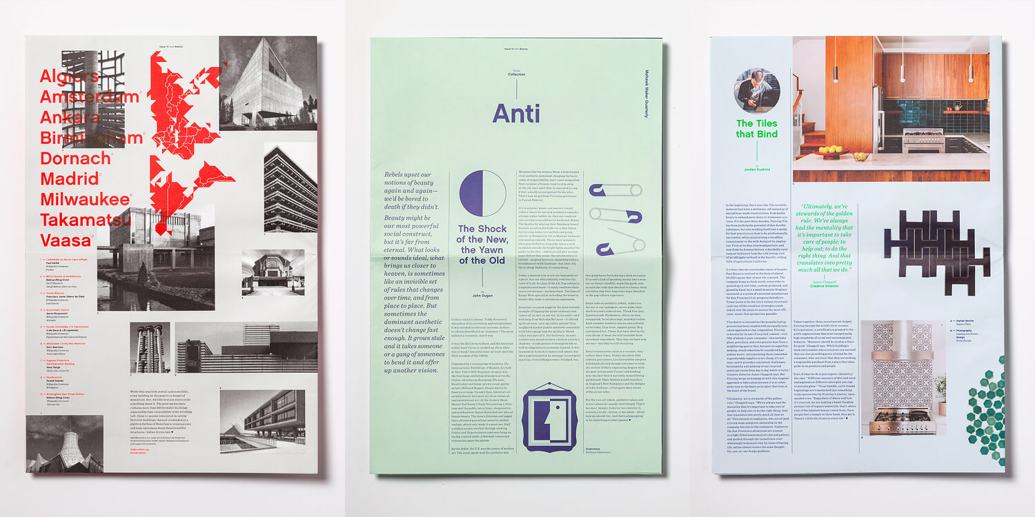
See how these images have used grids and applied designs to them. Hopefully they inspire you to try your own if you’re new to the world of grids in design. This doesn’t just apply to print design either, and works for digital too.
I’ve mentioned this in a previous blog post to help you create a dynamic graphic design portfolio by mixing up your page layouts.
Hopefully by now you have a lot of inspiration to take with you for your next graphic design project. Use grids for any design project, as it’s not limited to these examples below. What I recommend is that you experiment with using grids in your work, to really see what’s possible.
Even if you’re a beginner, open up a new document now and just play around with using grids, and see the different layouts you can create. Be patient with it, as everything new takes time to gain confidence and experience. After some trail and error (and with helpful guides like this one today), you can use grids to take your work to the next level!
Some Extra Help With Grids / Further Reading
- Thinking With Type by Ellen Lupton: A book mainly on how to use typography correctly, the history of type, and how to use typography with grids too. An excellent read which I highly recommend.
- How To Use The Baseline Grid: The baseline grid is basically applying your typography to the baseline, with grids applied. It’s a good read if I say so myself, and covers everything you need to know to apply the baseline grid to your work.
- Grid Systems by Josef Müller-Brockmann: An excellent book (which is quite a heavy-going / technical read), that fully covers everything you need to know about using grids. Highly recommended!
- Using The 8px Grid: An excellent recourse if you’re designing for the web / UX & UI design.
- My Illustration & Design Blog: I regularly update my blog to help you improve your design, art and illustrations. I share helpful, consistent content to take your creative knowledge and expertise to the next level. See all of my blog posts here and see what takes your fancy!
Dos and Dont’s of Using Grids
- DO make your designs consistent by sticking to the grid, BUT don’t be rigid in your design layouts. You are in control over the grid, so be flexible with it. If that means you have to break the grid sometimes for a better design, do it.
- DO experiment, learn and develop your understand of the grid, as it will help your overall design work.
- DO use grids with the baseline grid.
- DO have fun!
- DO use master pages in InDesign to create your grid layout. This will duplicate throughout your entire document and save you a lot of time.
- DON’T apply a grid without thought and consideration.
- DON’T design in the grid gutters – avoid wherever possible!
- DON’T have separate grid layouts for different pages / artboards. The whole point of a grid is to be consistent.
I Hope You Have Enjoyed This Article!
If you were a little skeptical about using grids within your designs, hopefully this article has helped persuade you to use them. If so, welcome to the world of the grid! There’s no turning back here – much like when Neo takes the red bill from The Matrix! If you always had a grid-friendly mind, then I hope this article has helped you gain more knowledge into the world of the grid.
So what have we covered:
- A grid is made up of rows, columns and a gutter.
- Using grids in your design work is a great aid. It will help you structure your designs consistently.
- You are in control of the grid.
- A gutter is a space between columns and rows. Generally, you don’t place anything within the gutter unless images or text stretches over them.
- You can setup grids in Adobe Indesign, Adobe XD, and Adobe Illustrator, and other design software packages.
- Experiment, have fun and gain confidence with the grid!
I really hoped this blog post has been helpful to help you understand and get to know grids in design. I’ll love to hear what you think about this article by commenting below or on my social media links below! Many thanks guys, and happy ‘gridding’!
Many thanks for listening and visiting my news page today. You can follow what I’m up to on my Twitter, Facebook or Instagram pages, I’ll really appreciate it if you do, and don’t be afraid to say hi to me! Many thanks again, and have a great day!
Want to learn how to take your designs to the next level?
Curious to learn about grids in design?
If you know me, you know how much I love grids (and also the baseline grid).
I’ve been using it my design work for years, and just simply love anything with a grid. From magazines, brochures, to posters, grids are everywhere in the design world. With the fact that grids allow you to make sure everything is inline with other graphic elements, grids help keep a natural and engaging flow (especially with multiple pages). It’s really improved my own design work, and I’m excited to share what I’ve learnt with you today.
In a nutshell, using grids will help you become a better designer.
Within this blog post you will discover how to use grids within your design work. I’ll be sharing my knowledge of how to create grids in Adobe InDesign, with other brief mentions of how to set up a grid in other Adobe programs. You will learn why grids are important, what makes up a good grid, and much more.
So, sit back, and learn how to use grids within your design work. But first off, what even is a grid?
What Is A Grid?
A grid is a mostly termed as a series of rows, columns and gutters in an art board.
Whenever I think of a grid, I think of classic design posters and newspaper prints (which use column grids excellently). Setup by the designer, grids are invisible and aren’t shown in print / digital (unless the designer wants it). Designers use grids to make their designs consistent and make engaging designs. In print, grids are commonly used in devices such as magazines, newspapers to books. Digitally, grids lends itself well to website design and app design in particular.
Think of a grid like a skeleton or structure to a design. Skeletons and structures are the backbone of a design, but it’s the skin on top which people recognise. These ‘structures’ offers flexibility and reasoning to a design.
Grids can be found in most Adobe programmes, such as InDesign and Adobe Illustrator (and other design programmes like Affinity). If you’re familiar with guides on Photoshop, grids are like guides on steroids. Not all guides are consistent, but most grids are, especially when used through multiple artboards and pages.
There’s single grid designs (like the example below), which is ideal for simple documents. Multicolumn and multi-row grids allow for more complex design solutions – like books and publications for example.
Why You Should Use Grids
You should use grids within your design work because it strengthens consistency, gives you flexibility, and gives you structure to work towards. There’s nothing worse than starting a design from a blank piece of paper. Where do you place the first piece of content? Where do you place the typography? Where do you even start?
Using grids eliminates all of these problems.
Setting up a grid gives you a structure to work towards. Think of grids as a building’s foundations when building a house. With the foundations in place, the house builders can start building the house piece by piece. After it’s built, the foundations are invisible – but is crucial to the buildings stature. This is the same with grids. You need grids to form a consistent and structured design, but is invisible on the surface.
Grids are especially important over multiple pages or artboards. When you look at magazines to newspapers – grids are commonly used to ensure consistency throughout. Not only do grids add consistency, it gives you flexibility. Most people think grids restrict freedom, but quite the contrary. More restrictions allows you to be more playful and experimental – starting from a blank artboard offers too much freedom.
Not only are grids used in print, it’s also commonly used in digital and web design. I’m highly confident most famous designers uses some form of grid. I love using grids and highly recommend it to all designers – beginners to experts.
History Of The Grid
‘Villard De Honne’ first used the ‘design grid’ in the 13th century by ‘. He used ‘margins of fixed ratios’ within his printed publications (which is still a popular way of constructing a grid to this day).
Things got interesting later in the 20th century. Movements like Bauhaus and De Stijl experimented with the use of grids in design. Creating epic posters in particular, all with the aid of the grid. One of my favourites Armin Hofmann, used grids within his poster designs perfectly.
Josef Müller-Brockmann popularised grids in the 1960’s, especially his book ‘Grid Systems’. According to DesignLab, Müller-Brockmann:
“Pushed the limits of grids by creating modular and rotated grid systems. He published a detailed handbook (essential reading for any graphic designer) called Grid Systems in Graphic Design, and it represents a collation of the insights gained through his illustrious career”.
From this point, grids have gone from strength to strength. Rule of thirds, golden ratio, grids for publications and newspapers, to excellent books like ‘Thinking with Type‘, which discusses the importance of grids in design.
Sometimes we don’t even realise we are viewing an ‘invisible’ grid, look at BBC News for example – a prime example of grids in website design.
What Is A Gutter In Grids?
Gutters are the space between rows and columns, and is set by you, the designer. Designers avoid placing any items within the gutter. This isn’t a strict formula, as text and images can go over the gutter. Remember, to create good designs using grids, you need to be in control over the grid (and not the other way round).
Designers use gutters to help them arrange things consistently around an artboard (or over multiple pages / artboards).
For example, you may choose 3 rows and columns with 5mm gutter over one artboard, like my example below. Can you notice the many different arrangements with this grid that I can come up with? It’s fluid and flexible depending on what I want out of the design.
Generally speaking, most of my elements above aren’t arranged on the gutter. I can decrease and increase the gutter if I wish, which changes the row height and column width. When choosing a gutter, think about what you’re designing, and how much space you want to play with.
It’s a good idea to play around with rows, columns and gutters.
How To Setup A Grid In Adobe InDesign
With a new document open (doesn’t matter what dimensions your file is), go to ‘Layout’ > ‘Create Guides’. Within this panel you can choose the number of rows, columns and gutter size. Be sure to tick the ‘Preview’ box.
Do also note the ‘Options’ settings as well, as this is important. You can choose to fit your guides to your margins, or your page. For example, look at my example below.
The above is a series of 3 rows and columns fitted to my default margin. The below image is fitted to the page. Can you notice the difference? The rows can fit to either your margins, or your page – so it’s important that you consider this.
I usually choose fit to margins, but depends what I’m working on. (If you’re working with the baseline grid, do check out my previous blog post to help you setup your Adobe InDesign guides with the baseline grid).
Once you’re happy with your choice, click ‘OK’, and your guides are created! To toggle your guides on or off, press the ‘W’ key. In most cases, guides are not printed or shown within the final artwork.
If you want to change your guides or remove them completely, you can do this by going to ‘Layout’ > ‘Create Guides’ > ‘Remove Existing Ruler Guides’. This removes all guides from the document, for you to create new guides.
I always make sure I lock my guides in place, so I don’t accidentally delete them! To do this, go to View > Grids & Guides > Lock Guides.
Pro Tip: Applying Grids Across Multiple Pages In Adobe InDesign
The best way to apply grids across multiple pages in Adobe InDesign is to follow the steps above, however applying them on your ‘Master’ page. If you’re unfamiliar with Master pages in Adobe InDesign, think of them as your template. Whatever you put on your Master page, this will appear across the pages throughout your document.
To do this, open a new document (or load an existing one), and go to your ‘Pages’ panel (if you can’t see your ‘Pages’ panel, go to ‘Window’ > ‘Pages’). You can see the number of pages in this panel, and this panel also shows ‘A-Master’. Double click on the pages icon opposite. This takes you to the Master page(s). As soon as you start editing, adding, and deleting things from this ‘Master’ page, it will affect your whole document.
Creating grids on your Master pages is a spicy recommendation. When applying grids to your Master pages, your guides / grids will show throughout your document. I highly recommend you do this as it guarantees consistency throughout and ensures good design work.
How To Setup A Grid In Adobe XD
Grids are an essential tool in any print and digital project. Websites, apps, and digital pages use grids, so it’s important you learn how to enable grids in a digital design software like Adobe XD. To setup a grid in Adobe XD is just as easy as using grids in Adobe InDesign.
Simply create a new artboard of any size or dimension, and hold CMD, shift and ‘ on Mac to enable the grid. This same combination of keys disables the grid. To change your grid, click on the artboard name, and go to ‘Grid’ in the lower right corner of the window.
You can change the number of columns, colour, transparency, and width. It’s a powerful tool as you can copy these grids into other artboards throughout a project, by clicking ‘Make Default’. ‘Use Default’ uses the default grid setup that has been placed within the project. You can also work with a square grid by holding CMD and ‘.
Adobe XD doesn’t allow you to use rows like Adobe InDesign. My guess will be that rows aren’t needed for digital projects, as columns are more than enough. This may change in the future as Adobe XD as it’s still a relatively new application for Adobe.
Design Grid Inspiration
Below shows a few different grid examples that you can use as inspiration for your own design project.
This is by no means a ‘set in stone’ approach, and should be considered as an inspiration. Your art board or page dimension may be completely different to the examples below. These images are all linked, so I recommend you check these talented artists and designers out! These include Studio Feixen, Dale Andrew Mina and Brett Newman.
See how these images have used grids and applied designs to them. Hopefully they inspire you to try your own if you’re new to the world of grids in design. This doesn’t just apply to print design either, and works for digital too.
I’ve mentioned this in a previous blog post to help you create a dynamic graphic design portfolio by mixing up your page layouts.
Hopefully by now you have a lot of inspiration to take with you for your next graphic design project. Use grids for any design project, as it’s not limited to these examples below. What I recommend is that you experiment with using grids in your work, to really see what’s possible.
Even if you’re a beginner, open up a new document now and just play around with using grids, and see the different layouts you can create. Be patient with it, as everything new takes time to gain confidence and experience. After some trail and error (and with helpful guides like this one today), you can use grids to take your work to the next level!
Some Extra Help With Grids / Further Reading
- Thinking With Type by Ellen Lupton: A book mainly on how to use typography correctly, the history of type, and how to use typography with grids too. An excellent read which I highly recommend.
- How To Use The Baseline Grid: The baseline grid is basically applying your typography to the baseline, with grids applied. It’s a good read if I say so myself, and covers everything you need to know to apply the baseline grid to your work.
- Grid Systems by Josef Müller-Brockmann: An excellent book (which is quite a heavy-going / technical read), that fully covers everything you need to know about using grids. Highly recommended!
- Using The 8px Grid: An excellent recourse if you’re designing for the web / UX & UI design.
- My Illustration & Design Blog: I regularly update my blog to help you improve your design, art and illustrations. I share helpful, consistent content to take your creative knowledge and expertise to the next level. See all of my blog posts here and see what takes your fancy!
Dos and Dont’s of Using Grids
- DO make your designs consistent by sticking to the grid, BUT don’t be rigid in your design layouts. You are in control over the grid, so be flexible with it. If that means you have to break the grid sometimes for a better design, do it.
- DO experiment, learn and develop your understand of the grid, as it will help your overall design work.
- DO use grids with the baseline grid.
- DO have fun!
- DO use master pages in InDesign to create your grid layout. This will duplicate throughout your entire document and save you a lot of time.
- DON’T apply a grid without thought and consideration.
- DON’T design in the grid gutters – avoid wherever possible!
- DON’T have separate grid layouts for different pages / artboards. The whole point of a grid is to be consistent.
I Hope You Have Enjoyed This Article!
If you were a little skeptical about using grids within your designs, hopefully this article has helped persuade you to use them. If so, welcome to the world of the grid! There’s no turning back here – much like when Neo takes the red bill from The Matrix! If you always had a grid-friendly mind, then I hope this article has helped you gain more knowledge into the world of the grid.
So what have we covered:
- A grid is made up of rows, columns and a gutter.
- Using grids in your design work is a great aid. It will help you structure your designs consistently.
- You are in control of the grid.
- A gutter is a space between columns and rows. Generally, you don’t place anything within the gutter unless images or text stretches over them.
- You can setup grids in Adobe Indesign, Adobe XD, and Adobe Illustrator, and other design software packages.
- Experiment, have fun and gain confidence with the grid!
I really hoped this blog post has been helpful to help you understand and get to know grids in design. I’ll love to hear what you think about this article by commenting below or on my social media links below! Many thanks guys, and happy ‘gridding’!
Many thanks for listening and visiting my news page today. You can follow what I’m up to on my Twitter, Facebook or Instagram pages, I’ll really appreciate it if you do, and don’t be afraid to say hi to me! Many thanks again, and have a great day!
 12th December 2021
