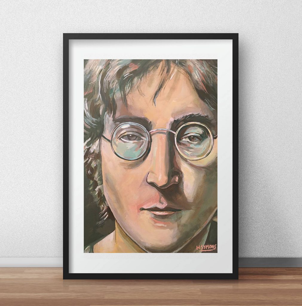
I love to paint portraits and faces, as their always so unique and interesting to paint, and it’s also a great way to keep on top of my game and practise my skill’s!
Keeping to limited colours of blue, green, white and yellow, this portrait illustration was produced with gouache, watercolour and pencil.
Instead of just showing you the final portrait illustration straight out, I wanted to show you a step by step process of how I built up this particular painting. Hopefully it can give you some sort of indication of my working process and how I like to build my illustrations. So here’s how I achieved the final outcome;

First things first, I start painting the portrait on watercolour paper, using graphite pencil, watercolour and gouache. Building up the layers, adding detail, light and dark, and adding form to the piece. As a lot of my work is based on colour, I mainly work from a limited colour palette, and generally don’t use more than 5 colours at a time within any illustration.

After I feel that the piece is finished, I scan this into Photoshop, where a big transformation normally takes place. I’m not too worried about the edges being jagged at this point, as this can easily be cropped in Photoshop. I scan all work at 300 dpi with a Canon scanner.

From here, I make adjustments and edit the artwork with a couple of Photoshop tools, add gradients, improve the light and darks of the piece, and generally make it more appealing on the eye. You can see that a big change has already appeared to the portrait.

For the next part of the editing process, I’ve changed the clothing of the figure, as I didn’t particularly like the old version, so I changed this to a round neck. Using the clone tool (which I love to use within Photoshop), I’ve changed some of the mistakes within the artwork, and have added a few gradients to the right hand side of the figure.

Editing is a big part of my illustration and working process, and the next step is no exception. Making his left ear bigger, improving the background of the piece, and adding more highlights to the piece, the illustration is now coming along well.

Finally, I wanted to change the light source of the piece, so have added different sorts of gradients, so the viewer knows exactly where the light is coming from. I’ve increased the overall colour of the piece, so have brought in more greens, blues and yellows, just so it looks better on the eye. And that’s about it!

I hope you enjoyed discovering how I build my illustrations, and have learnt something along the way.
Be sure to comment with your questions or queries about the piece, and I’ll be more than happy to answer them!
Enjoy the illustration!
Many thanks for listening and visiting my news page today. You can follow what I’m up to on my Twitter, Facebook or Google + pages, I’ll really appreciate it if you do, and don’t be afraid to say hi to me! Many thanks again, and have a great day!

 28th November 2014